Marie-Liesse de Solages
All projects
Edenred · The product for restaurant owners

The merchant portal

A portal merchants only visit two or three times a year. I have been its only designer for three years. My job was to make them want to come back.

FocusRedesign & prototype
RoleProduct designer · paired with a PO
Timeline3 years · 2023–2026
ContextEdenred merchant portal
FieldMeal vouchers
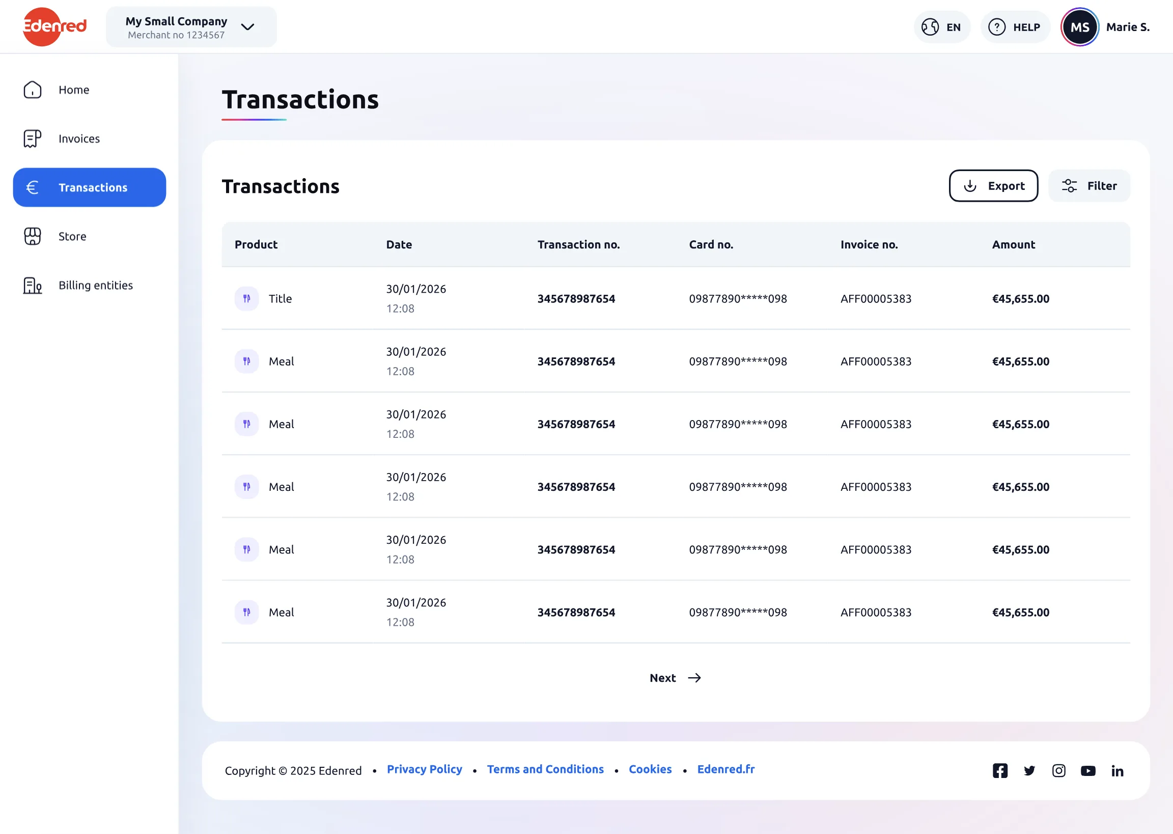
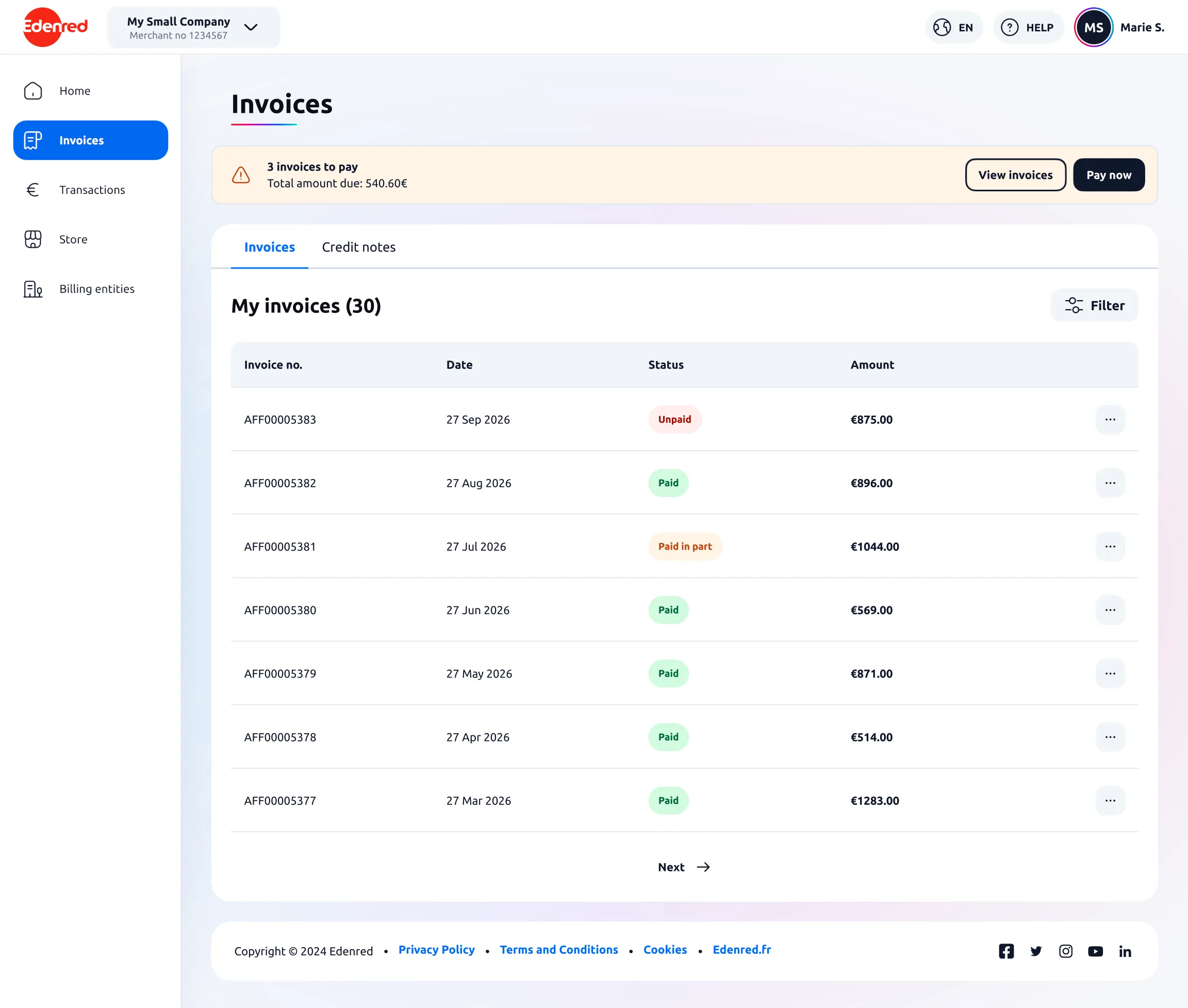
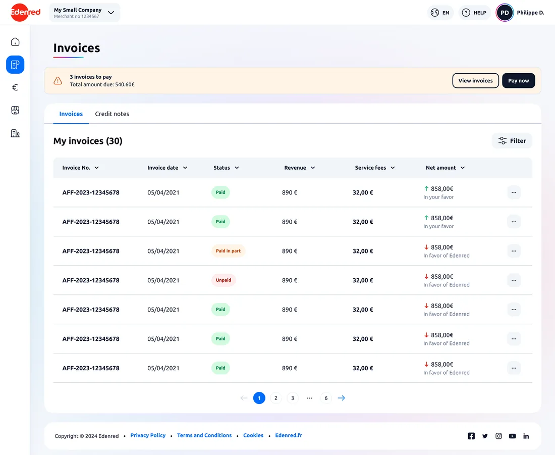
Invoices (desktop)
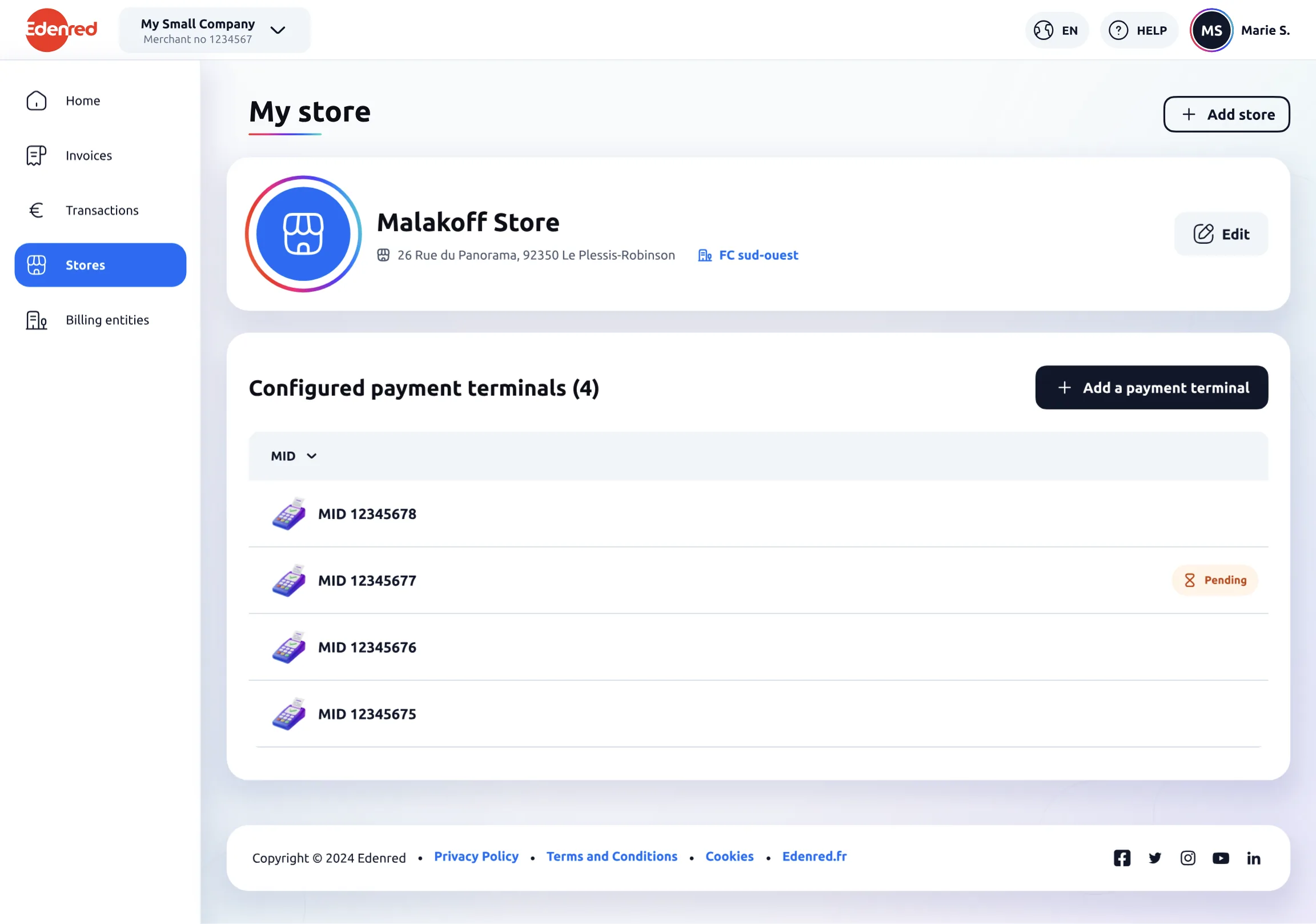
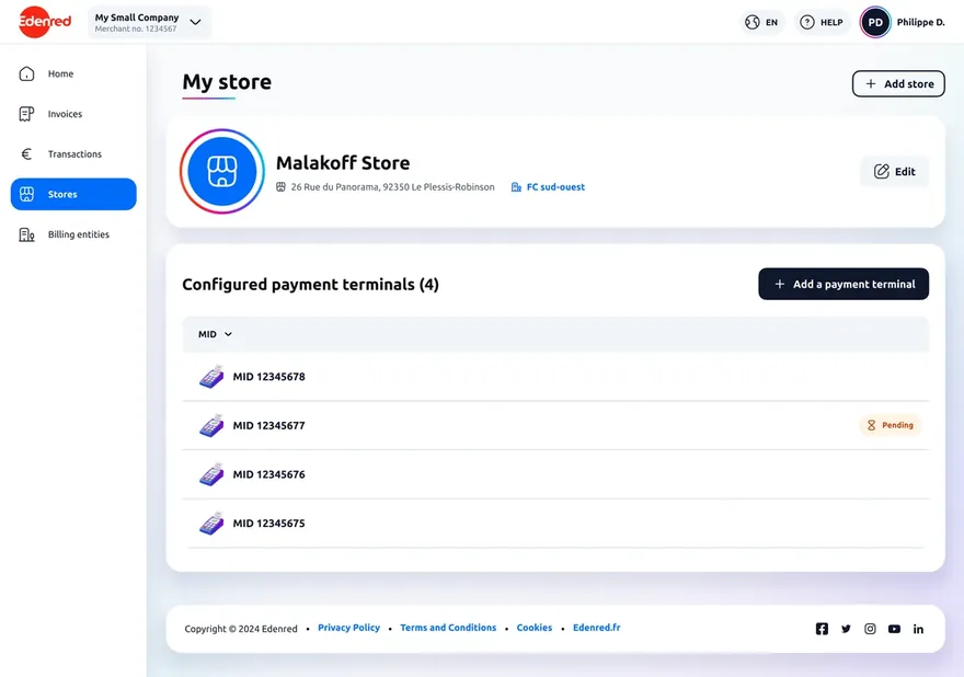
Points of sale (desktop)
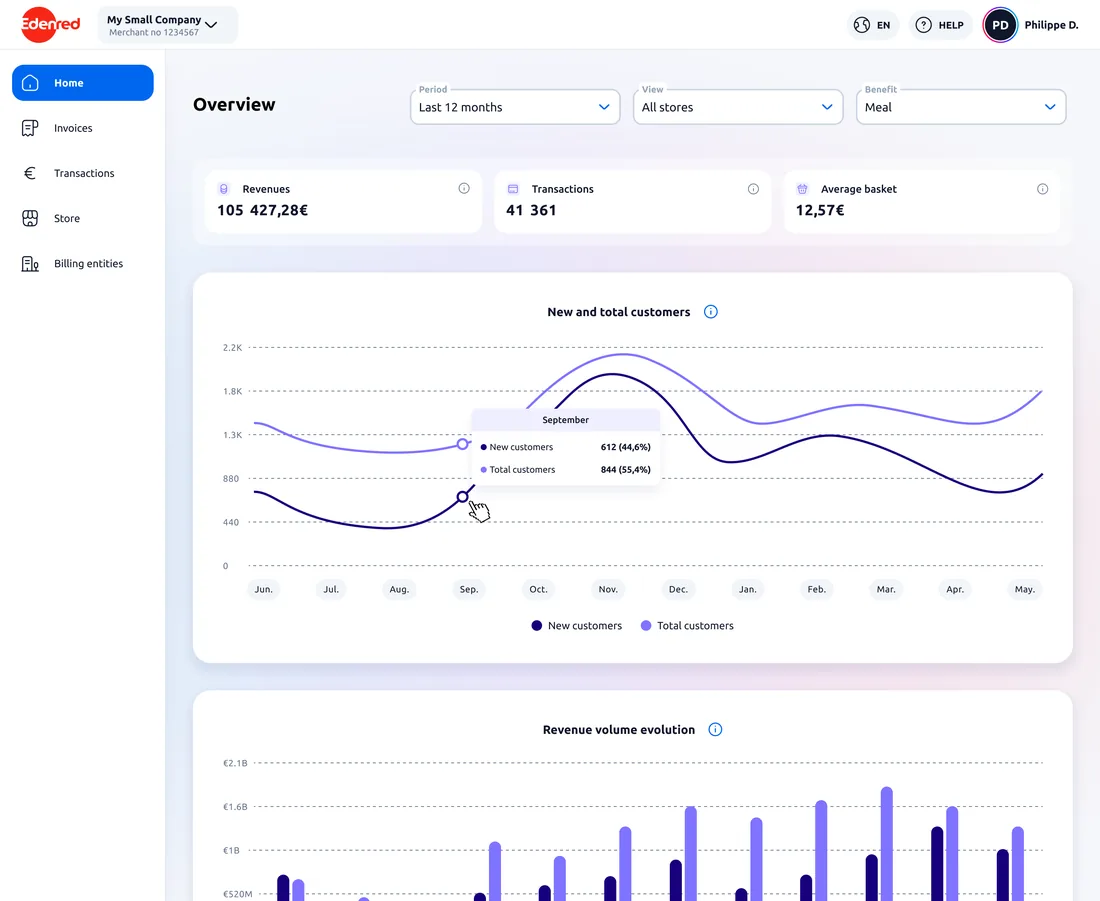
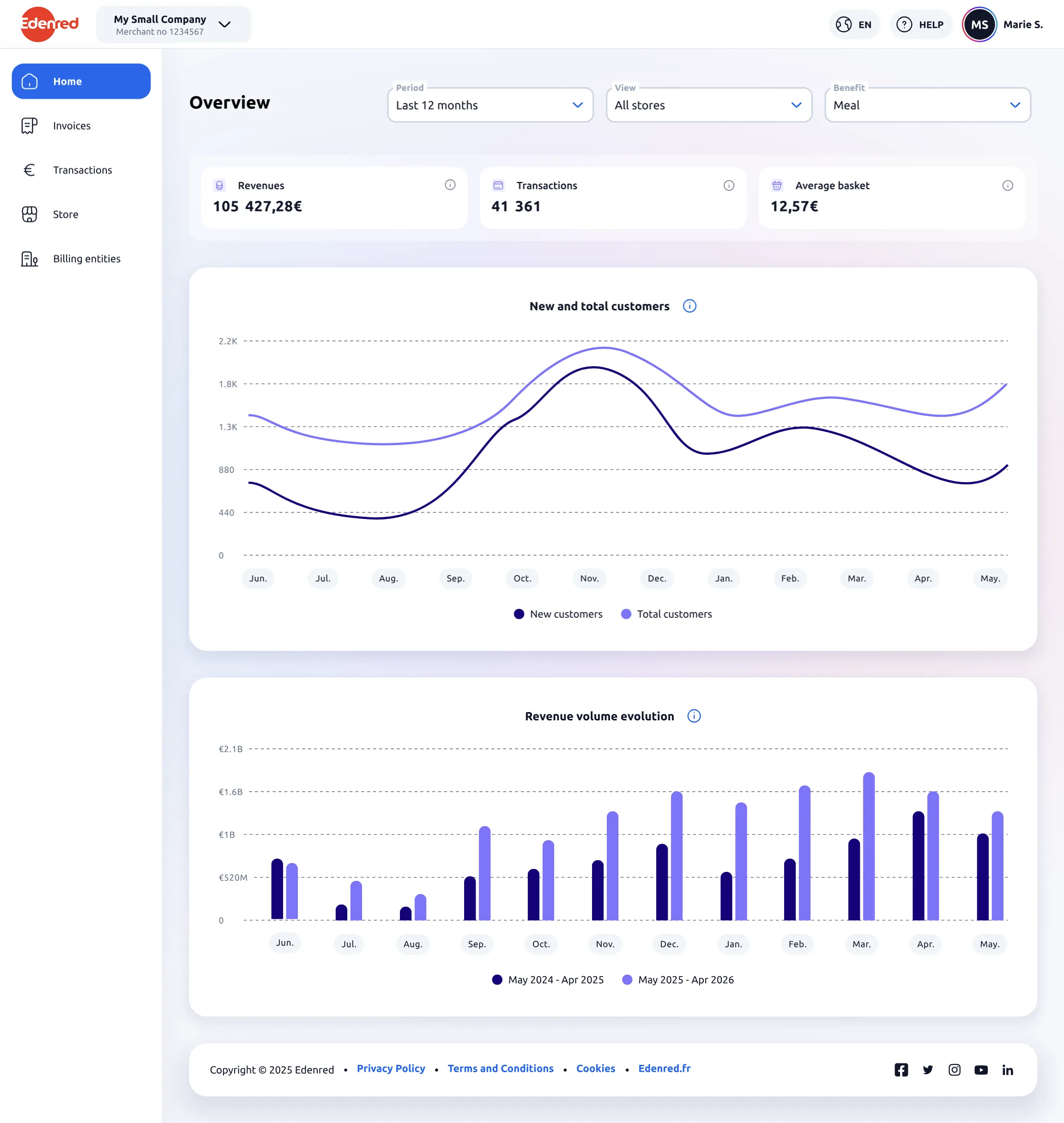
Dashboard (desktop)
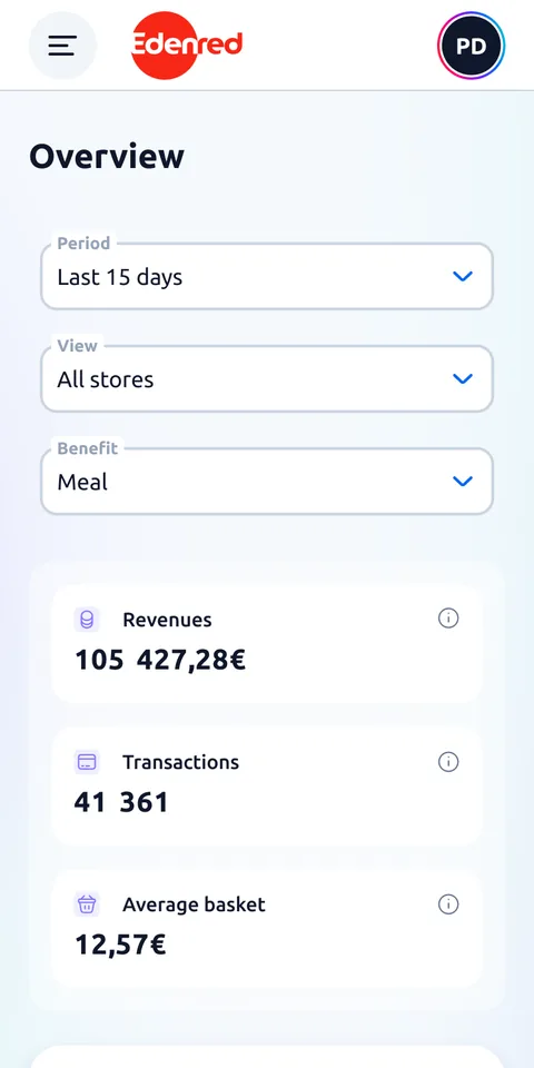
Home (mobile)
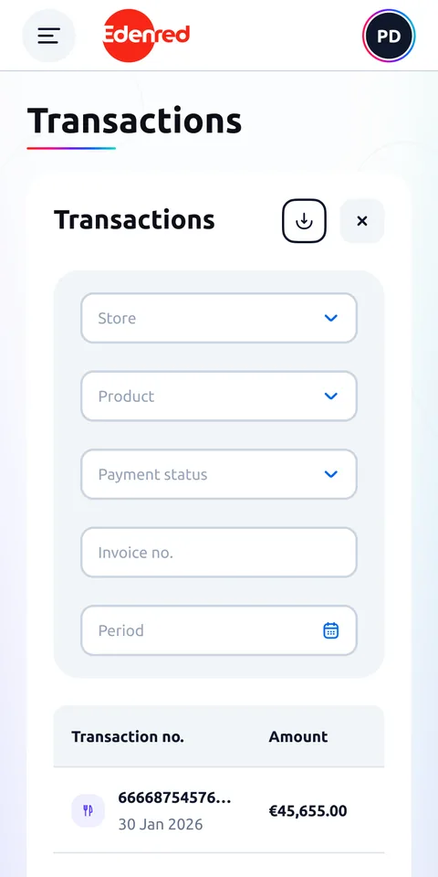
Transactions (mobile)
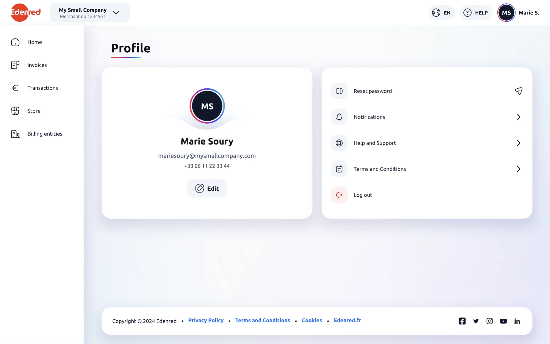
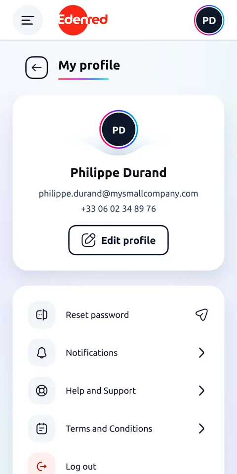
Profile (mobile)
Invoices (desktop)
Transactions (mobile)
Points of sale (desktop)
Profile (mobile)
In a few words

Edenred is the company behind meal vouchers. At the end of the chain are the shopkeepers and restaurateurs who accept them. The portal is their own space.

The catch: they rarely log in, two or three times a year. And many see Edenred as a service that charges them fees, not as a partner that brings them customers.

I was the product designer on the portal: screen design and screen states, UX and UI alike. I focus here on two highlights, the user tests on invoice readability, which I prepared and ran, and the home page, where I shaped the key figures so they make sense at a glance.

Overview

The portal at a glance

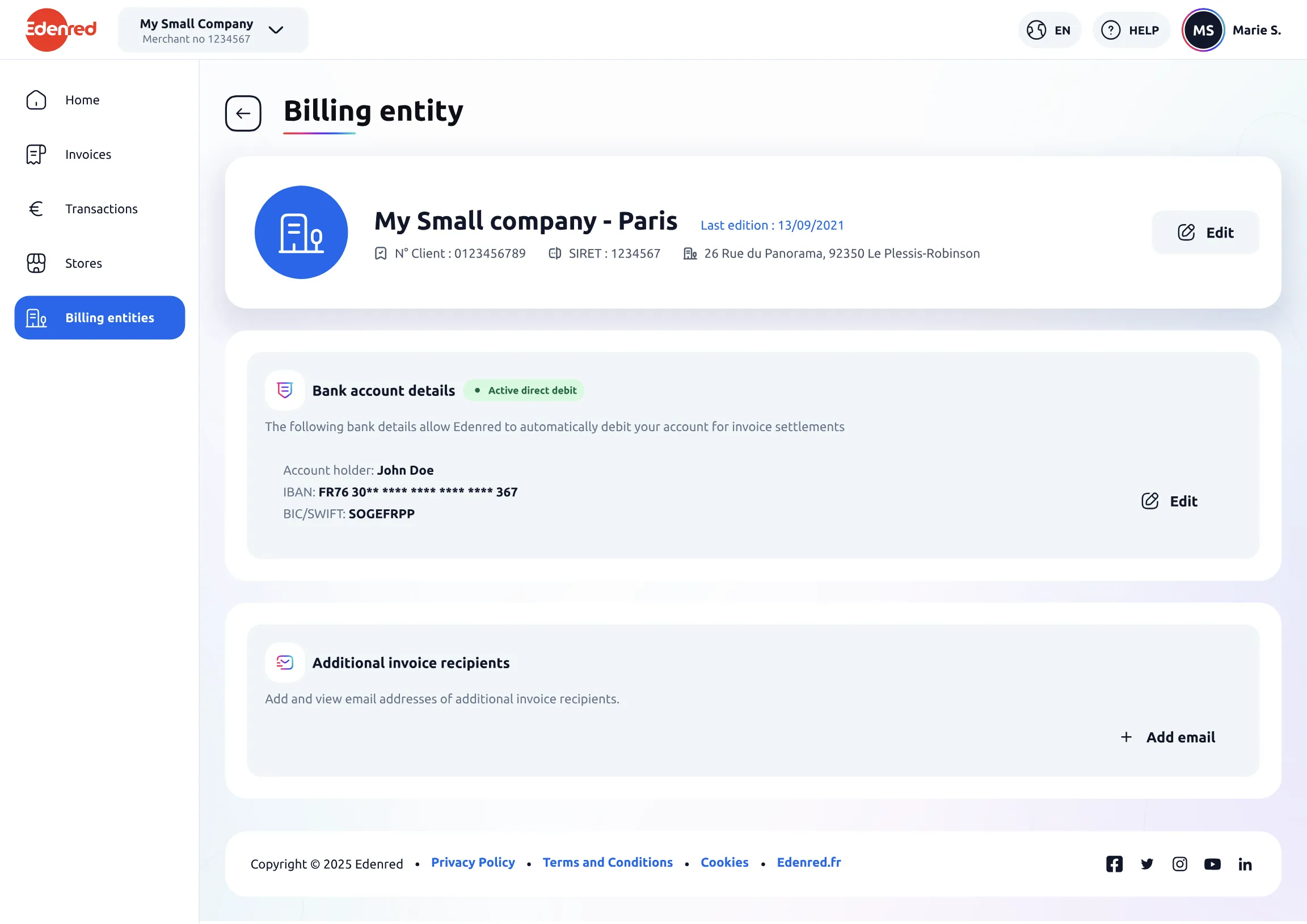
The portal brings together six areas: home, invoices, transactions, points of sale, billing entities and profile. Here it is for real, before we dive into the details.

Every screen in this project is in English: that is the portal’s working language, since it serves several countries.

Clickable prototype: navigate inside the screen

A real slice of the product: browse the menu and open the profile.

Decision 1

Making the invoice table truly readable

The problem

When merchants open the portal, it’s almost always for one thing: finding their invoices. Between the amounts, the fees and the statuses, there is no way to see at a glance what they owe, what they receive, and why. The result: merchants who second-guess the numbers, dispute them, and call support. All on the very screen that was supposed to be the simplest.

"During my free moments. […] When I have five minutes and I don’t feel like relaxing, I enter all the invoices into Excel."A restaurant owner, November 2023 interview
The insight

Merchants need that table, it’s their overview. What was left was making it readable, and that is where everything is up for debate: the number of columns, the labels, how much explanation to wrap around complicated figures.

The options

Three versions of the table, from the simplest to the most complete. What was at stake between them: how many columns, what to call them, and how much explanation to put around complicated figures. Rather than decide on my own, I showed them to real merchants: "here are your invoices, tell me what you understand".

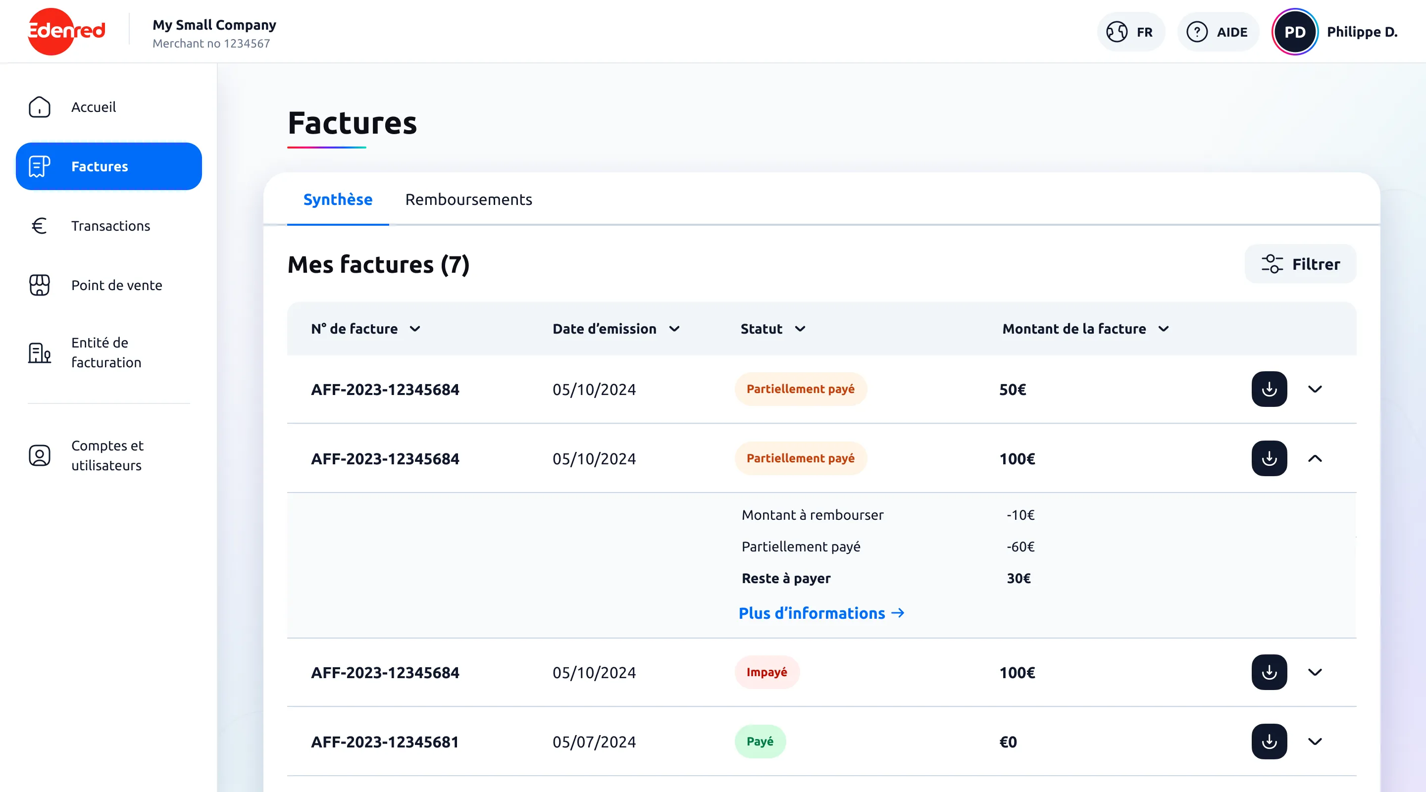
The three versions shown to merchants

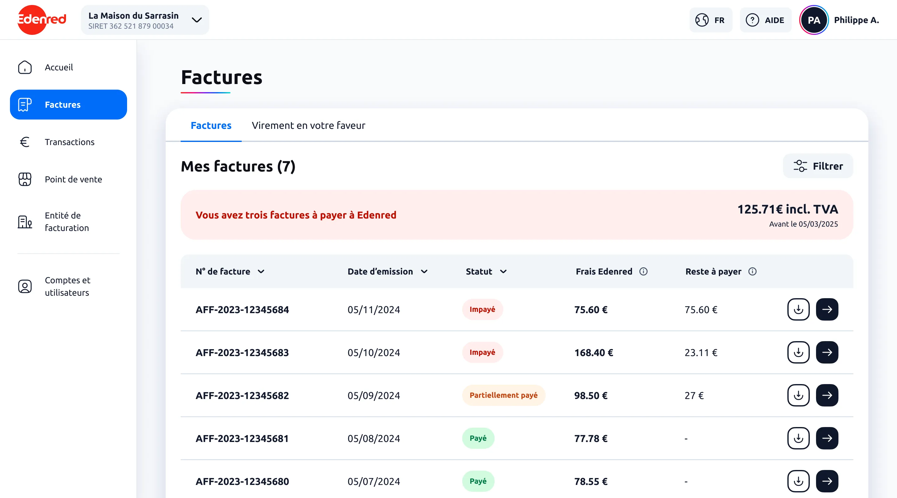
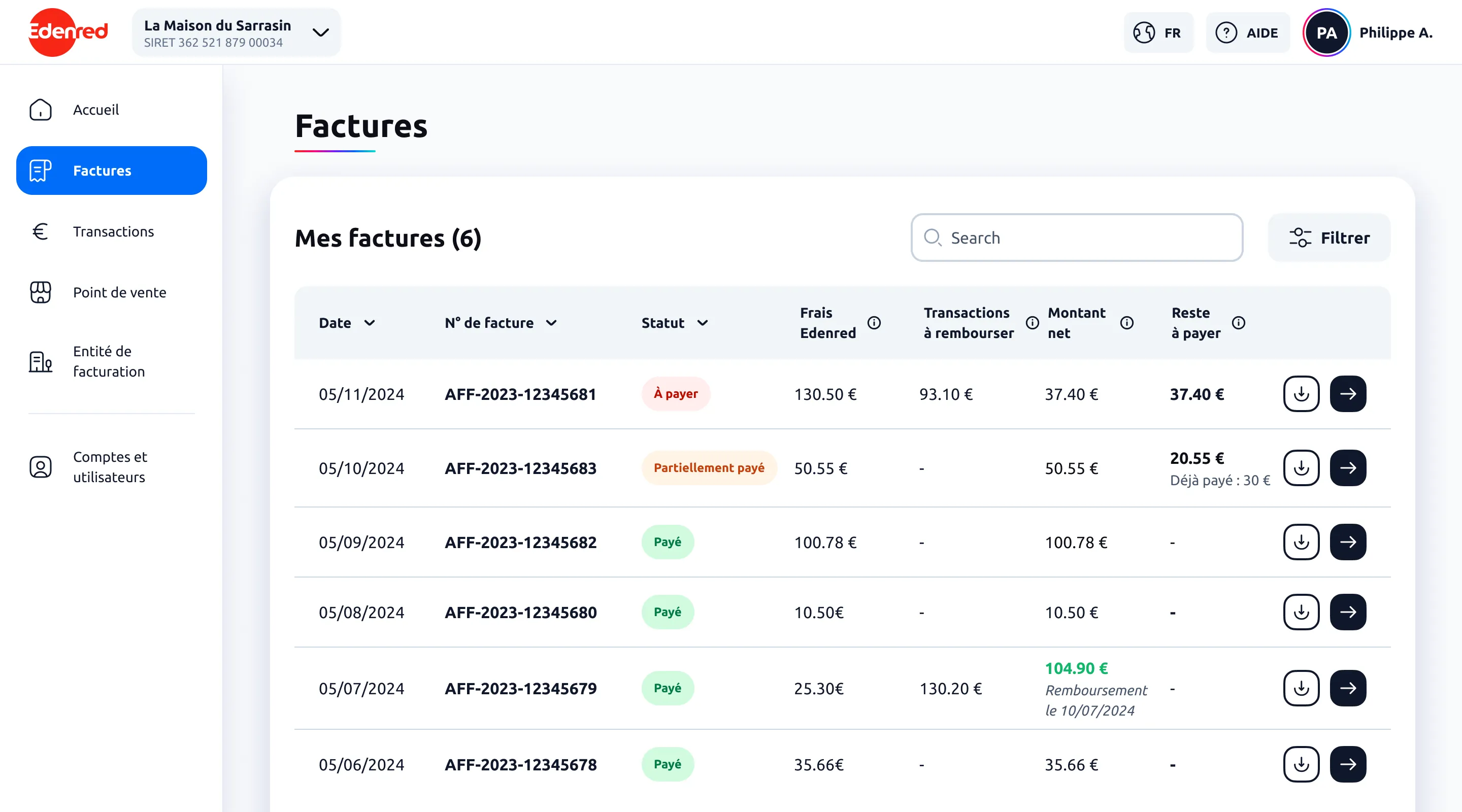
Tested version 1: seven columns, including Edenred fees, transactions to refund, net amount and amount left to pay

Version 1, everything on one line: every figure gets its own column, and the detail slips in under the amount.

The three versions, shown to about ten merchants.
The decision

The tests sorted what helped from what cluttered. Above all, they pointed to the real sticking point: even then, prices and fees remained too hard to read. That finding guided what came next, this time focused on the clarity of the amounts.

The result

This test didn’t solve everything, but it framed the subject, and that structured everything that followed. The table exists today in two versions, depending on the country’s billing model. It also opened the work still in progress: the payment journey and the invoice detail page.

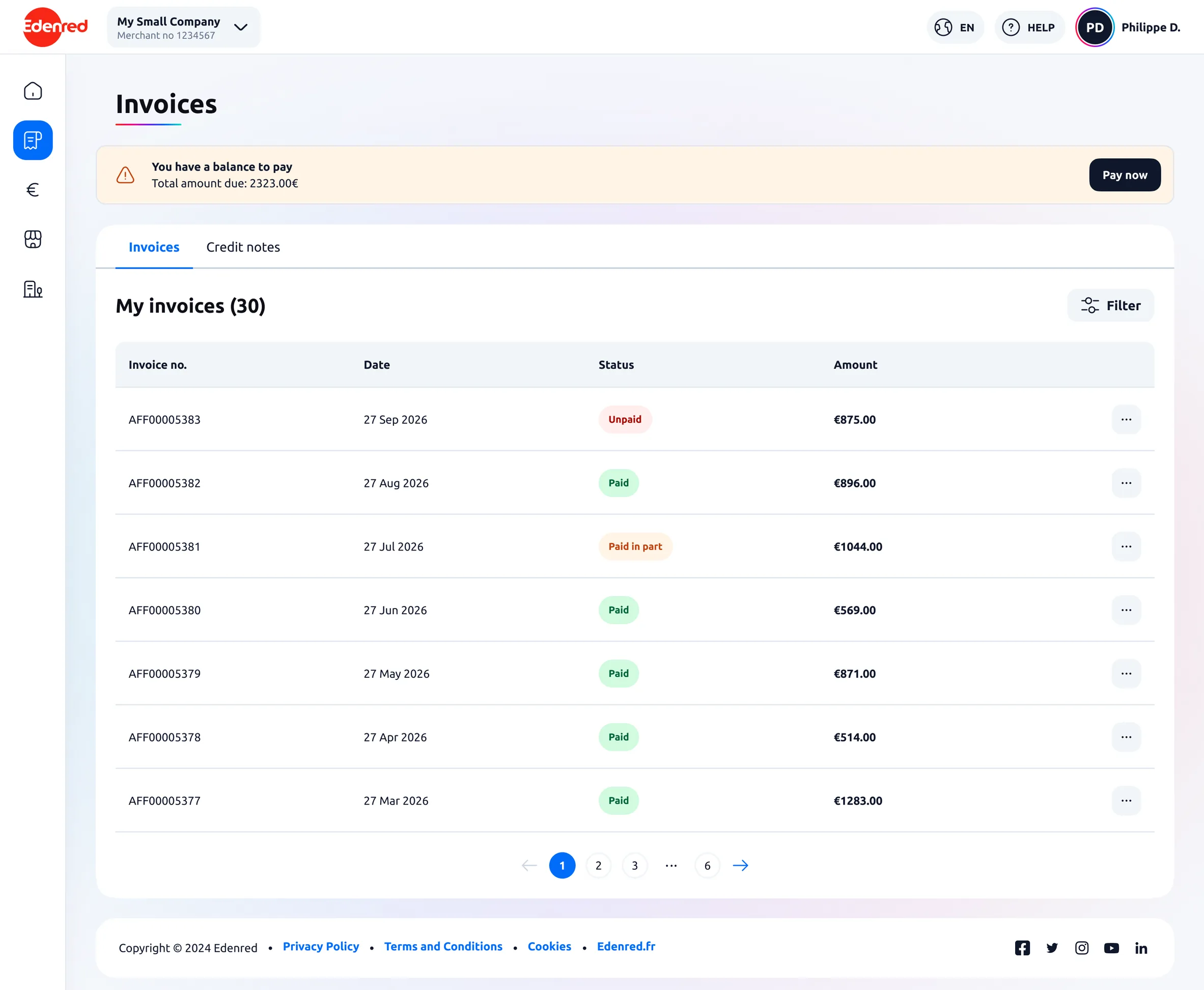
The version for countries where billing only goes one way: number, date, status, amount.
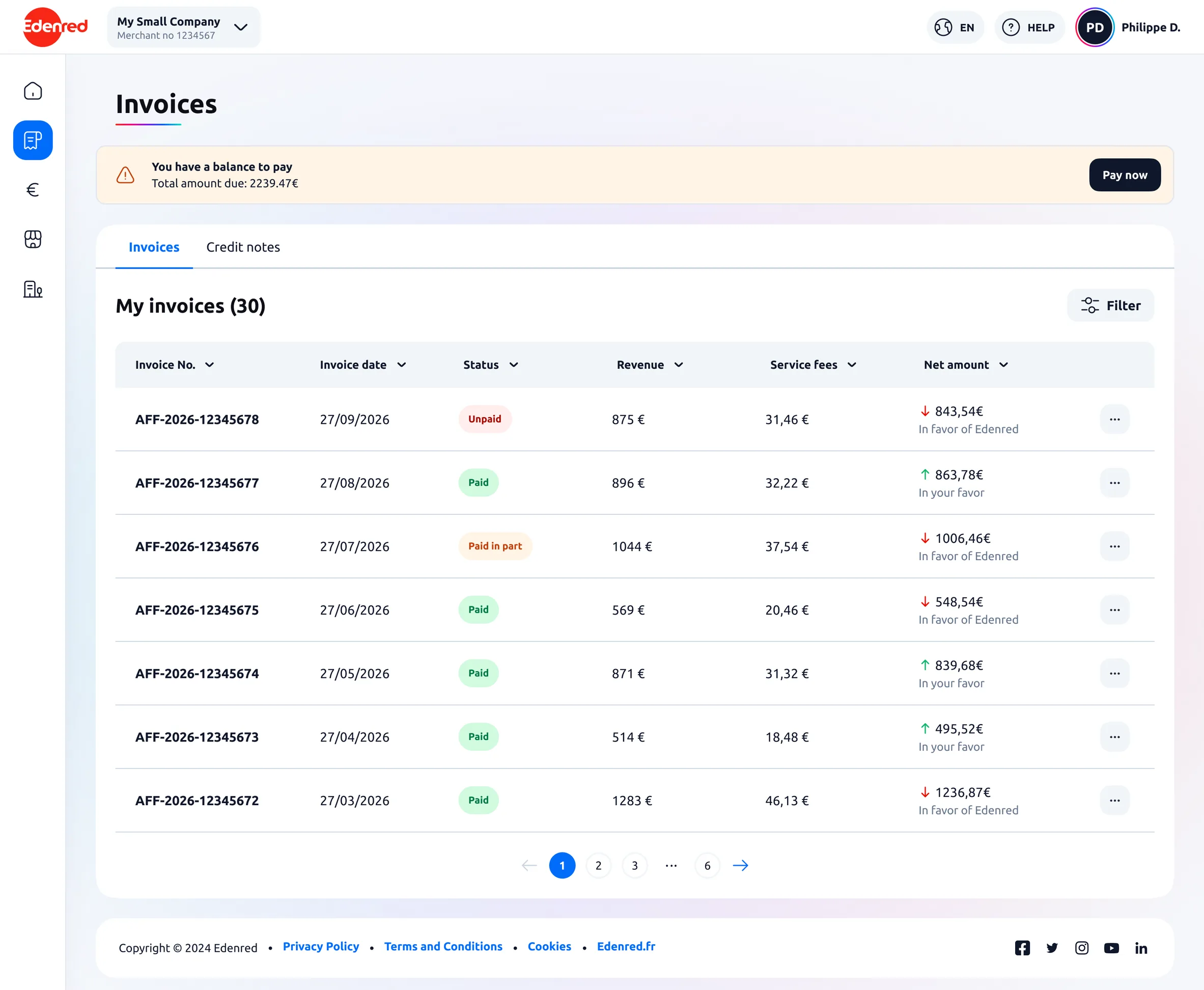
The version for countries where the balance can go either way: revenue, service fees and net amount, with an arrow giving the direction.
One-way billing Two-way billing
Revenue: what I bill Service fees: the costs Net amount: what’s left, ↑ in my favour or ↓ in Edenred’s favour

Drag to switch from one model to the other. Both versions exist side by side today.

Decision 2

A home page that finally shows what the merchant gained

The problem

Merchants rarely visit, and when they do, it’s for their invoice. In other words, to see how much Edenred costs them. By default, logging in means coming face to face with fees. And the interviews said something more: for them, Edenred is a perk they offer their customers, not a source of revenue.

The insight

We had to flip that impression right on arrival. The interviews said what to put there: without even seeing a mockup, almost every merchant mentioned the same reference points: their revenue, their number of transactions, their average ticket. Figures they already track to take the pulse of their business.

What you meet on arrival
Before
Your invoices
Total to paythe amount owed to Edenred

Signing in, by default, means coming face to face with fees.

What merchants named without being asked
Revenue Transactions Average basket

without seeing a single mockup

After
Home
RevenueTransactionsAverage basket
Your invoicesstill there, right after

Value first, fees second. Invoices haven’t gone anywhere: they just come after.

The decision comes down to an order: what the merchant came for lands after what they earned.
The options

Turning the home page into a dashboard came quickly and was never in question. What we discussed was what to put on it. I could pour in everything we know about a merchant, since there is no shortage of data, or stick to a handful of key figures. We kept three numbers that merchants named themselves in interviews, without having seen a single mockup: revenue, transactions and average basket.

The decision

I turned the home page into a dashboard built around those figures, chosen from the research. My part was shaping them: making them readable and meaningful at first sight, even for a merchant who only stops by once a quarter. I started with the most universal metrics, on a foundation designed to grow richer later.

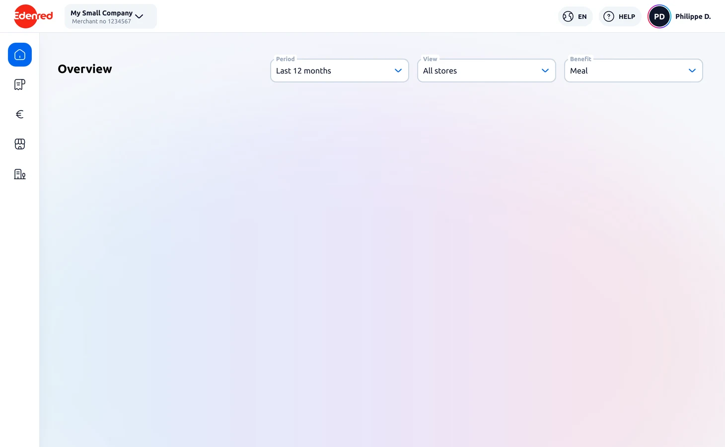
The portal shell: the sidebar, the header, the “Overview” title and the three filters
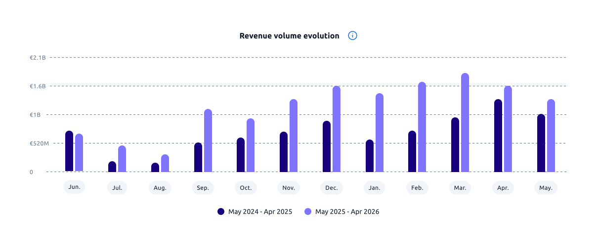
The revenue volume chart, month by month
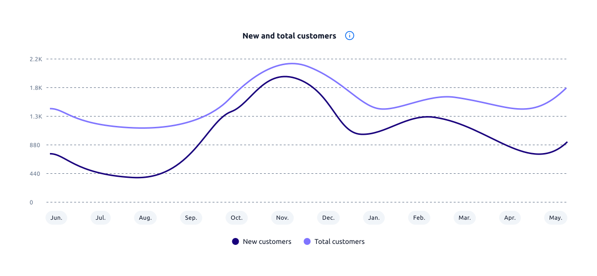
The new and total customers curve, month by month
Revenues
105 427,28 €
Transactions
41 361
Average basket
12,57 €
SEPTEMBER
New customers612
Total customers844
The three numbers we put at the top of the home, lifted out of the screen so you can read them. Sample amounts.
The result

A home page that opens on what the merchant has earned. From the moment they log in, merchants see what their activity with Edenred brings them, before fees even cross their mind. The portal starts to feel like a place of partnership rather than an invoice counter.

What is not finished

Finally, this portal reminded me that a product is rarely built in one piece. Some parts are polished, others still open: the payment journey, the detail page, the multi-entity structure we haven’t yet managed to make crystal clear. I’ve learned to own that in-between instead of hiding it, and to say where things stand.

A merchant logs in a few times a year, and that is the whole difficulty of the product. You can’t count on habit: every screen has to be understood on the first try, by someone who has forgotten everything since last time. It changed the way I prioritize information, settling what has to be read straight away instead of assuming users will come back later to figure things out.

I also learned something about testing. On the invoices, the test showed that price readability wasn’t there yet, instead of validating the version we were hoping for. In the moment, that’s frustrating. With hindsight, that’s the true role of a test: to diagnose, not to reassure. That finding is what made the next steps useful and precise.

The outcome figures for this project belong to Edenred, so I don’t publish them here. What gets measured on this page is how many times a merchant logs in per year, plus the volume of invoice disputes reaching support.