Login and account recovery
Edenred talks to three audiences and each one had its own door. Merchants come back two or three times a year, and by then they’d forgotten which door was theirs.
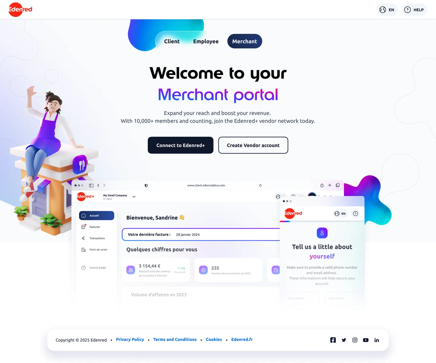 ✓ One front door
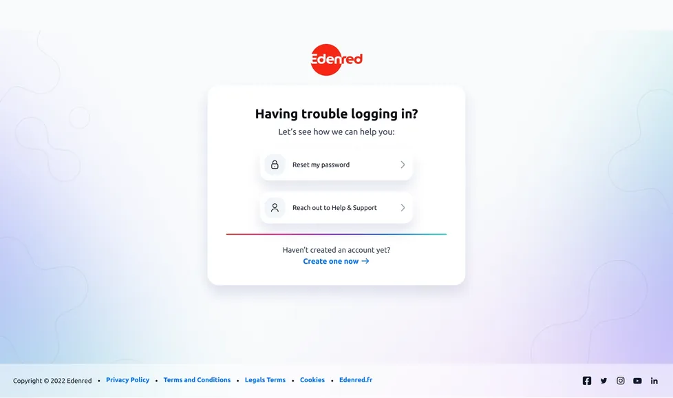 ✓ Reset, no detour
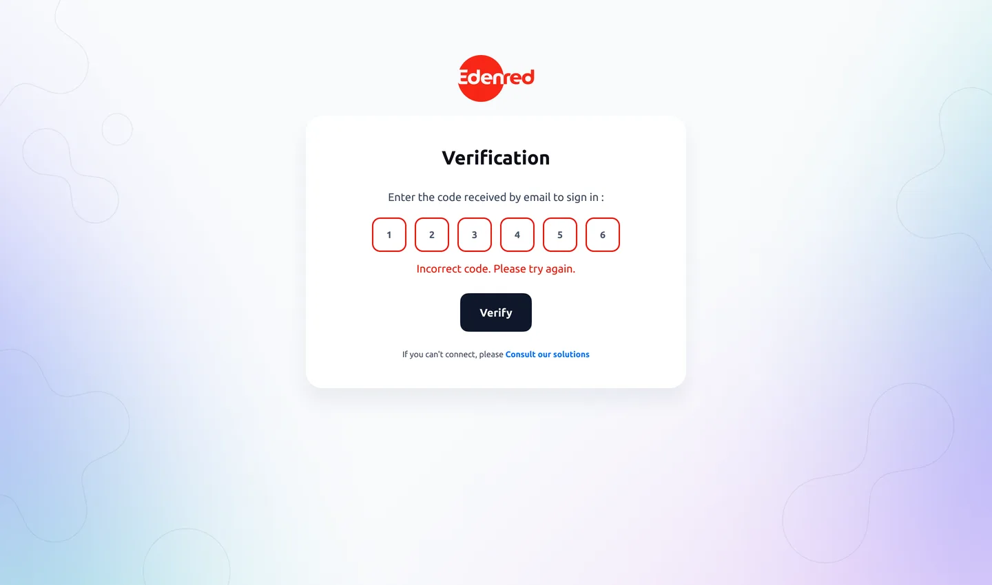 Wrong code
 ✓ Two ways out, right away
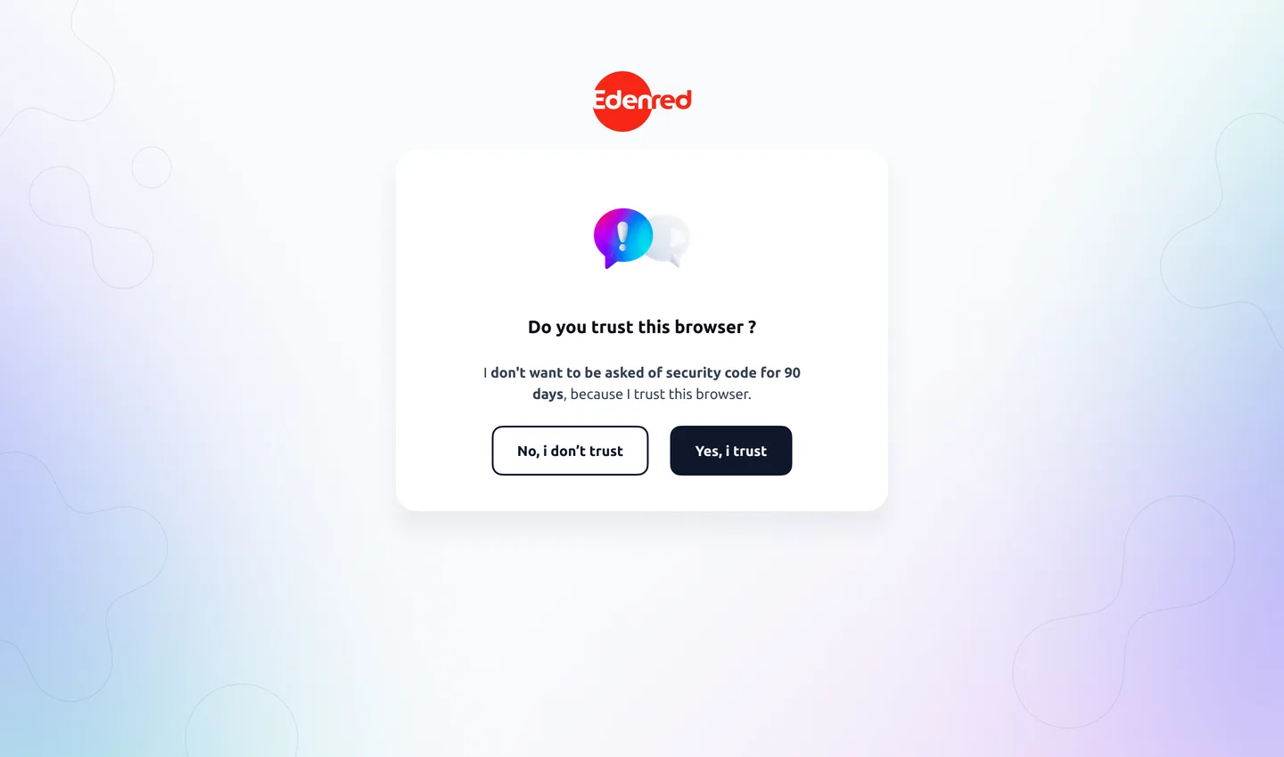 ✓ The trusted browser
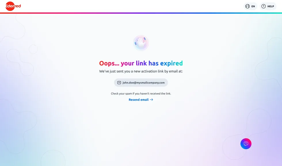 Expired link
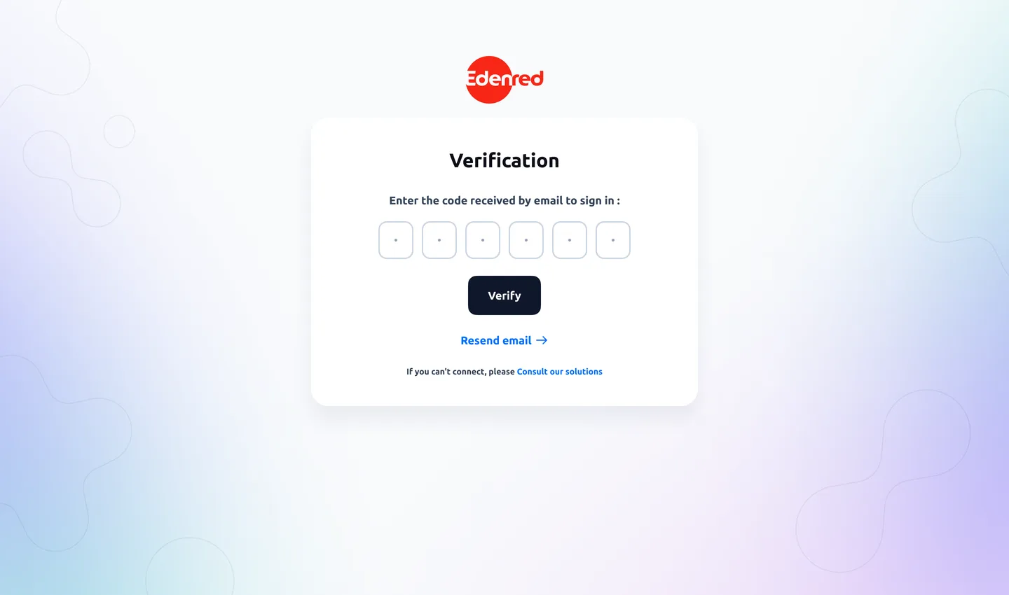 ✓ The code can be resent
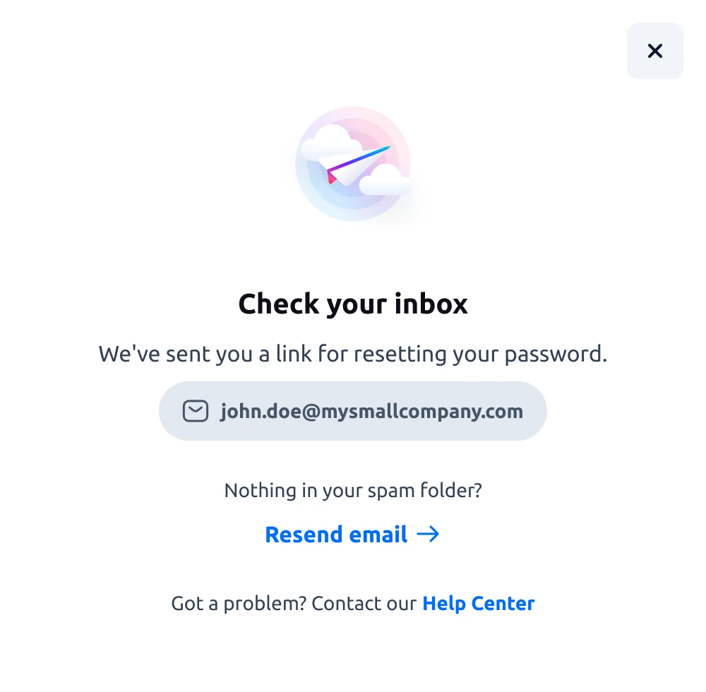 ✓ The link is on its way
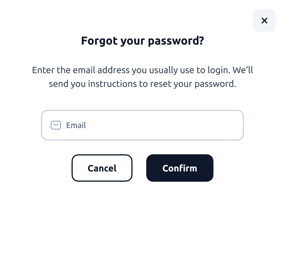 ✓ One field, that’s it
 ✓ The code, outside the app
 ✓ Lost username, by email
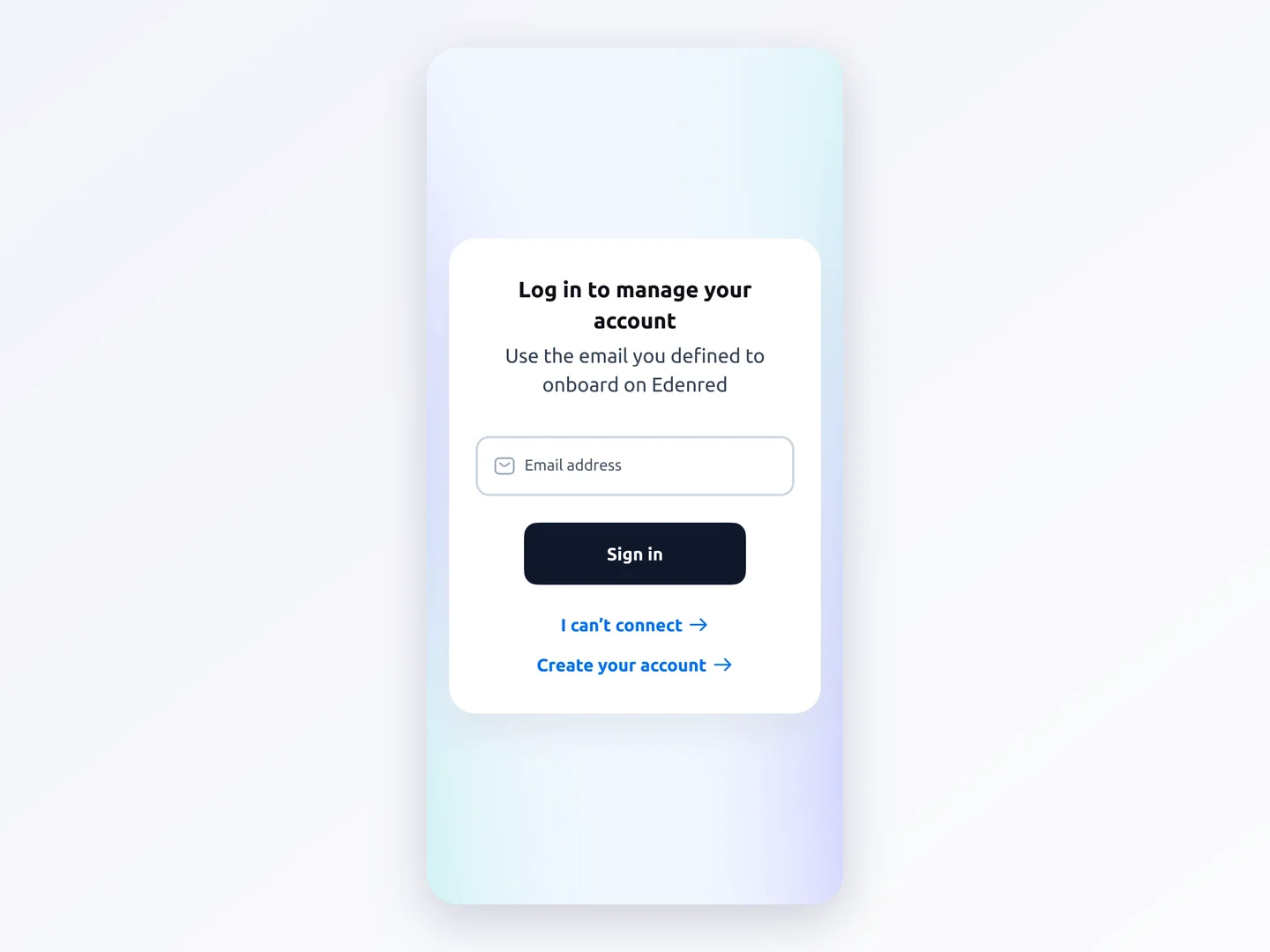 ✓ Same rule on mobile
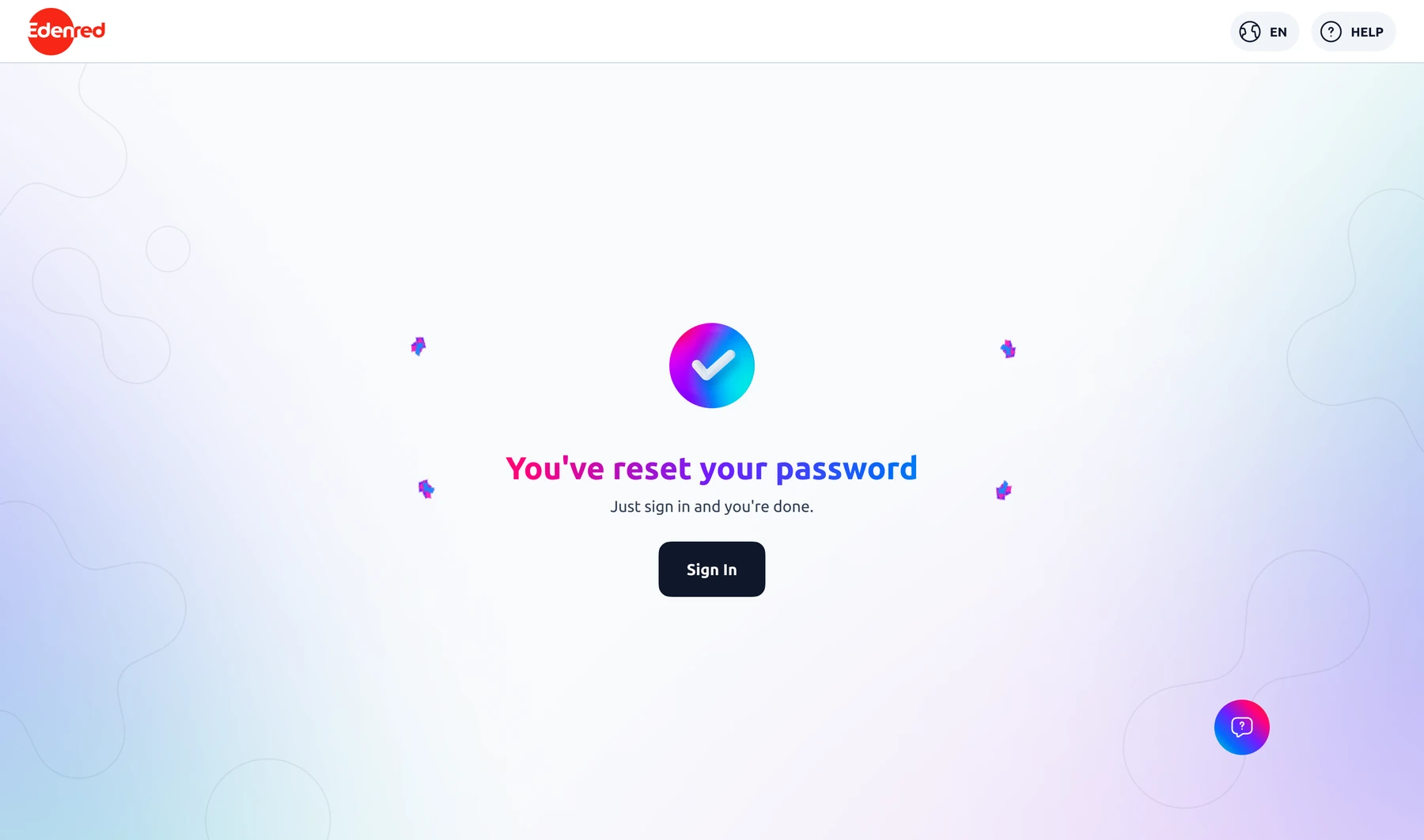 ✓ Done
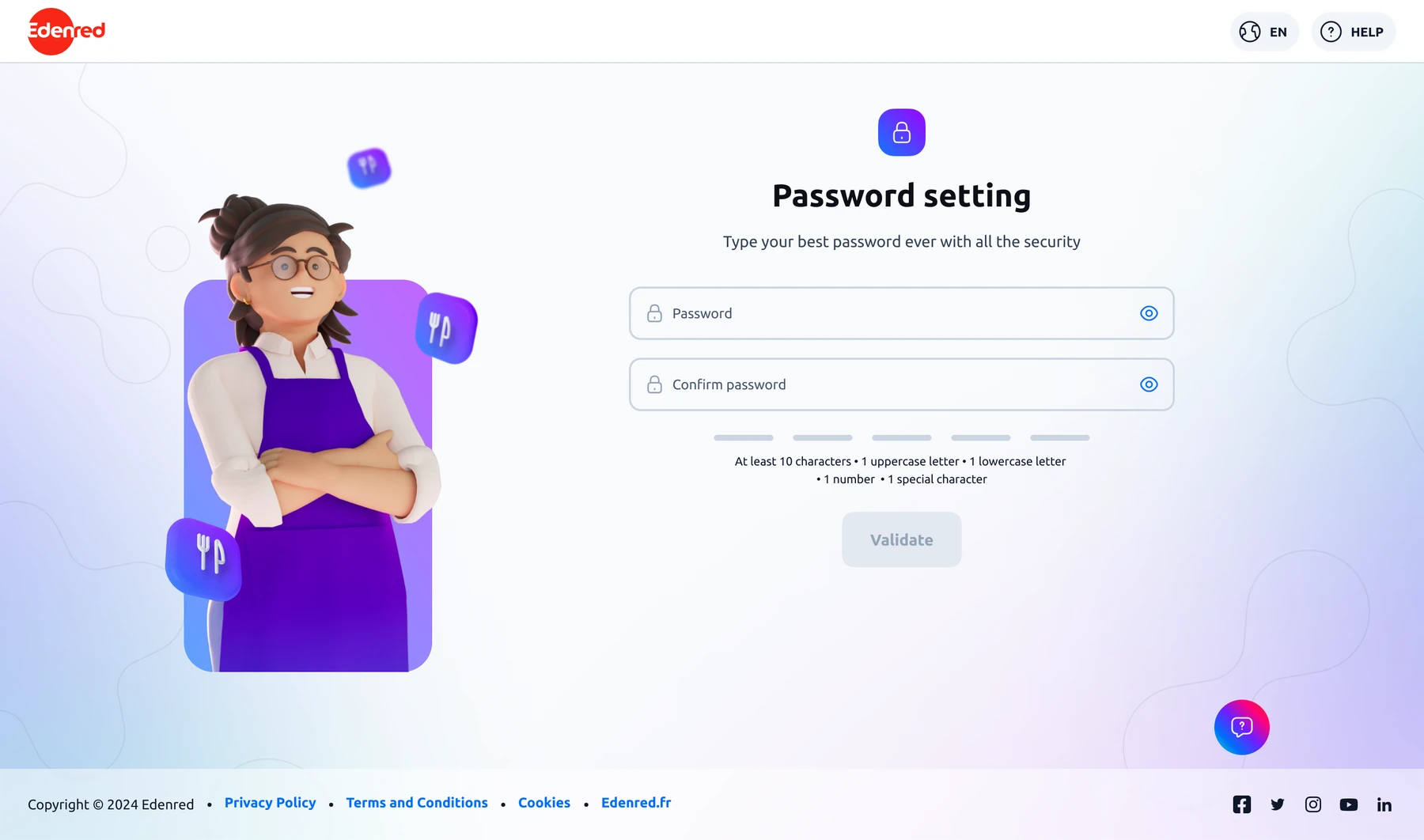 ✓ The new password
Edenred talks to three audiences. Clients are the companies that order vouchers and cards for their employees. Employees are the people who spend them and Merchants are the shop owners who accept them. The login is the shared doorway into these three worlds.
I focus here on two decisions. The shared entry point first: we looked for it as a team and I drew the options. Then the login flow rethought for merchants who rarely come back: I designed the screens, their states and the recovery flows.
The three separate logins are brought together into one shared entry point
Each audience had its own login page. People got it wrong all the time because a merchant is also, in everyday language, a client of Edenred. They headed for the Client area, which wasn’t theirs, and ended up stuck. The merchant portal saw very few logins.
A merchant is also a “customer”: they head to the Client area, can’t sign in, and can’t reach their own space and their invoices.
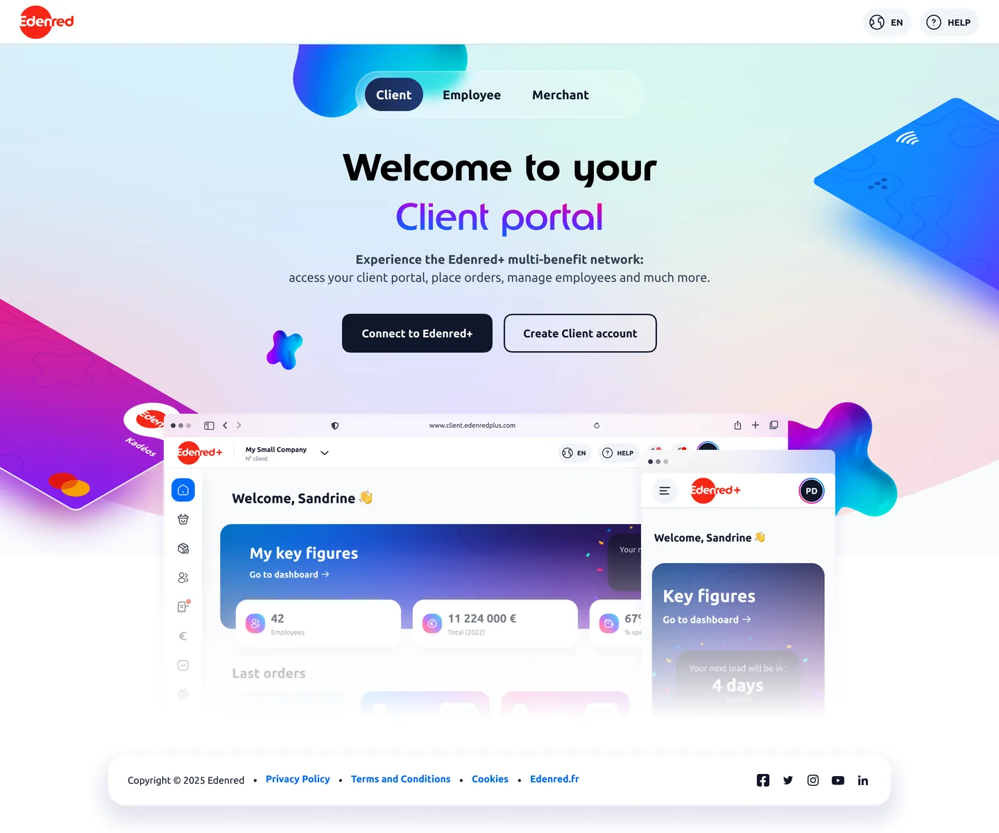
A single door that names the three spaces: you come in through any of them and move from one to another easily.
Research on small merchants taught us something simple: meal vouchers are a small part of their business, so they give them little attention. One more obstacle at the door and they don’t push on.
We first tried to keep the three pages separate and tell them apart better through their labels, the links, the way each space announces who it is for. Merchants still went to the wrong site. The word “client” speaks to them, and nothing tells them that Edenred calls “Merchant” the space that’s theirs.
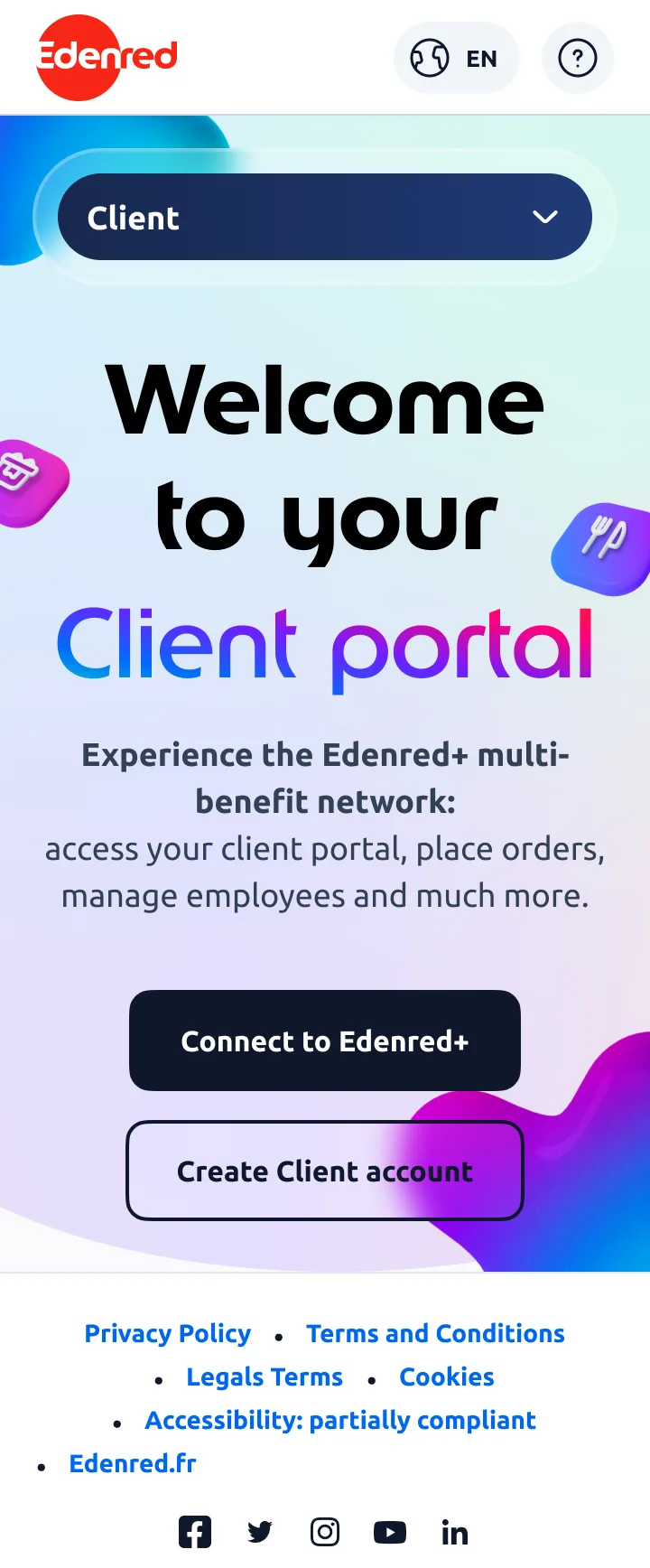
We brought the three audiences together on one page that speaks to them. They switch from one to another in a click and each audience then leads to its own login. We explored this solution in a workshop: I mocked up proposals and we merged what worked in each.
The Client / Employee / Merchant hub is a page with three tabs on desktop and a dropdown menu on mobile so the choice stays clear.
A login for merchants who come twice a year
Merchants let months go by between two visits to the portal. In the meantime they forget their password, their username, sometimes the link itself. I designed the login for that moment: someone coming back after a long time away.
How rarely they log in shapes everything, right down to security. When merchants say they trust their browser, the email OTP is only requested again every 120 days. We’re not going to keep pestering people who come so rarely.
"With [another issuer] it was much quicker to set up than the others. […] I got my access codes right after, I could go on it, find my invoices without any problems."A restaurant owner, November 2023 interview
- 2 or 3 times a year, that’s how many times a merchant signs in
- Support mostly sees login problems come through
- 120 days before asking for the OTP again on a trusted browser
The other path already existed: merchants called support or their account manager, and both were overloaded. Handling every dead end online meant redesigning five flows with their messages and their states: forgotten password, forgotten username, expired link, account not yet activated, wrong code.
I designed the login around recovery: every blocking point has its own flow instead of being a dead end.
Merchants sign in rarely. And by the time they come back, they’ve forgotten their password: it’s one of the main reasons they contact support.
A merchant coming back after six months is no longer stuck. The recovery flow starts from the same “Having trouble logging in?” and leads back to login, expired link included.
Password recovery, screen by screen
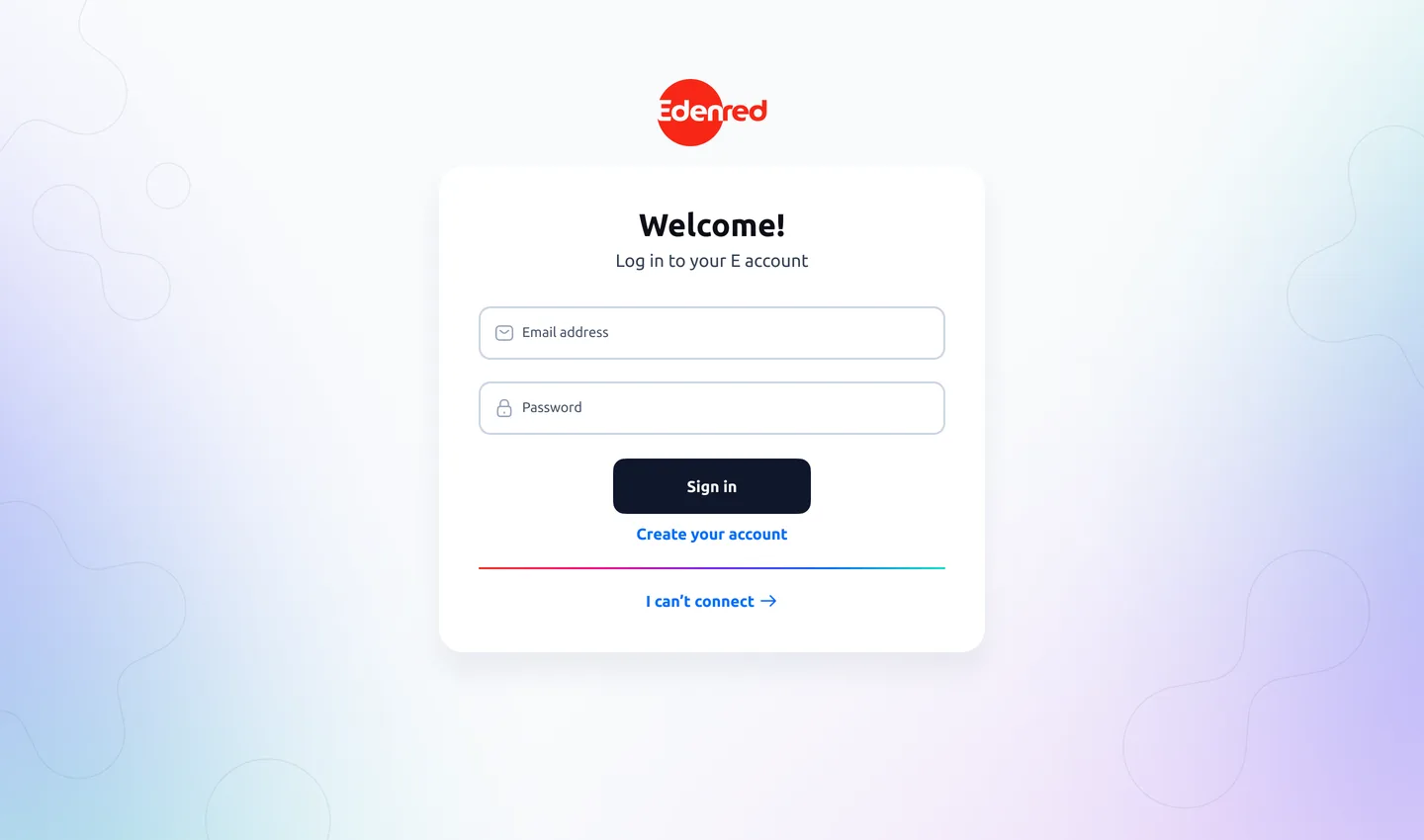
Sign in
Access your merchant portal
Username
What this project taught me
A login flow plays out on the day someone comes back after six months, without a password and without being sure they’re in the right place. We usually draw the path where everything goes right, and the dead ends after. Here I started with the dead ends. This project taught me to work with rules I don’t set.
The outcome figures for this project belong to Edenred, so I don’t publish them here. What gets measured here is the share of support requests tied to logging in, and how many password recoveries actually run to the end.