Marie-Liesse de Solages
All projects
Edenred · The product for restaurant owners

The design system

Designing inside an existing system

Inside Edenred’s design system, I built the whole merchant portal part: its components, its screens, their states. The ones that were missing, I created. The ones that existed and did not hold up, I challenged, including when they served other products.

The system itself existed before I arrived: the foundations, the tokens, the base components. I didn’t write its rules. I learned to design within them, and to spot the moments they needed extending.

Merchant portal · Components, screens and states designed inside the Edenred system
Components
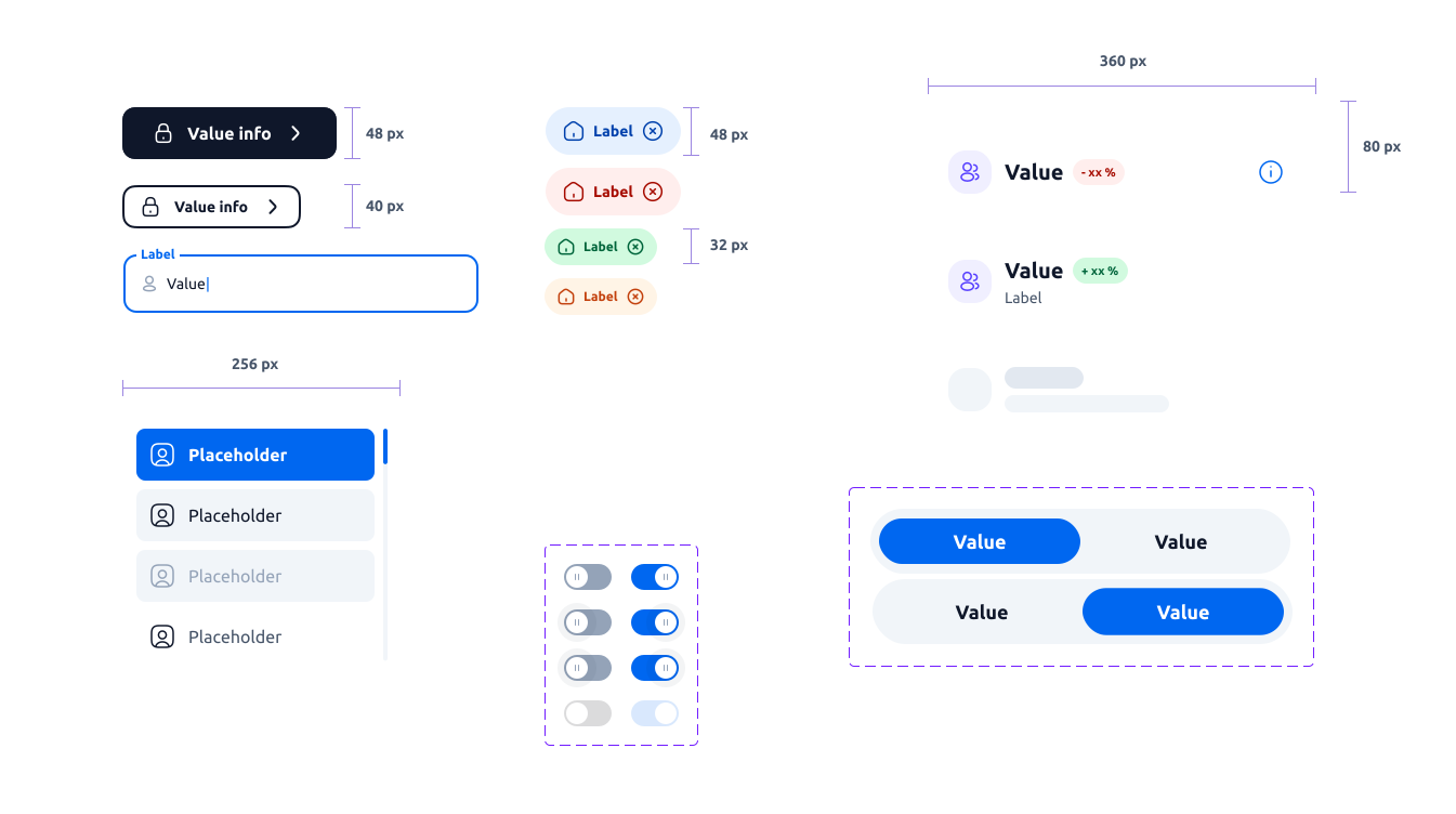
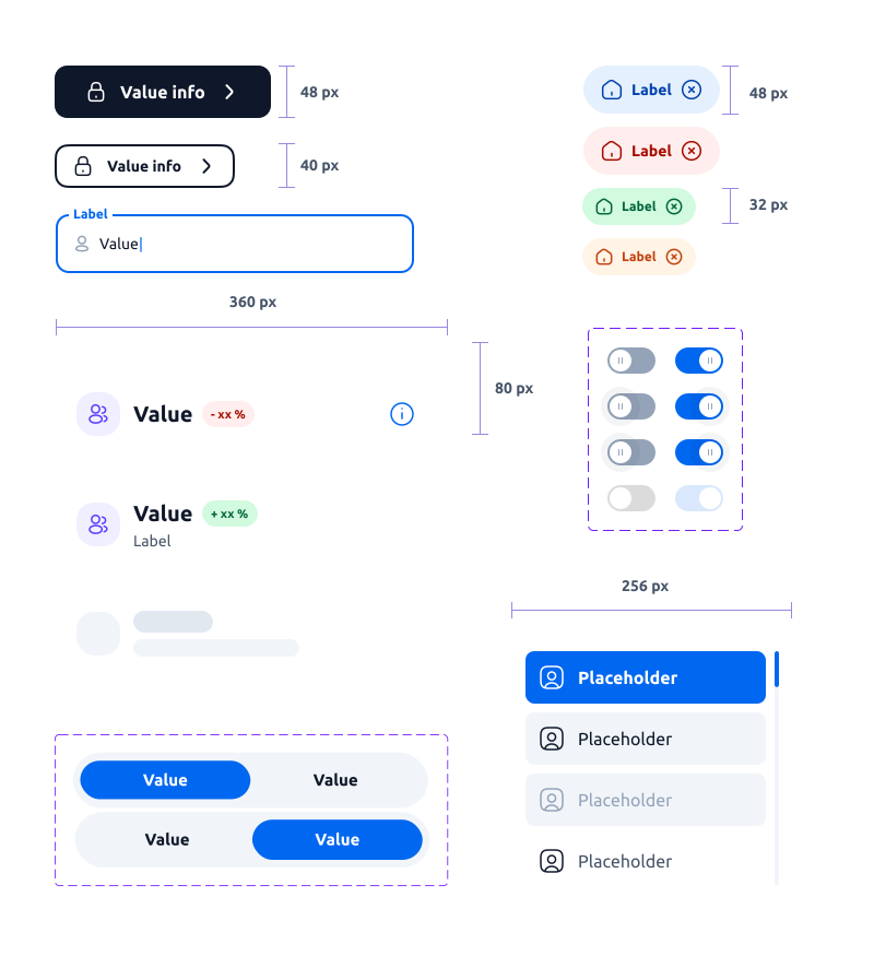
The design system components board, with their measurements: buttons, fields, badges, data tiles, dropdown, toggles and selector The design system components board, in mobile format
Variants Documentation Responsive
The product

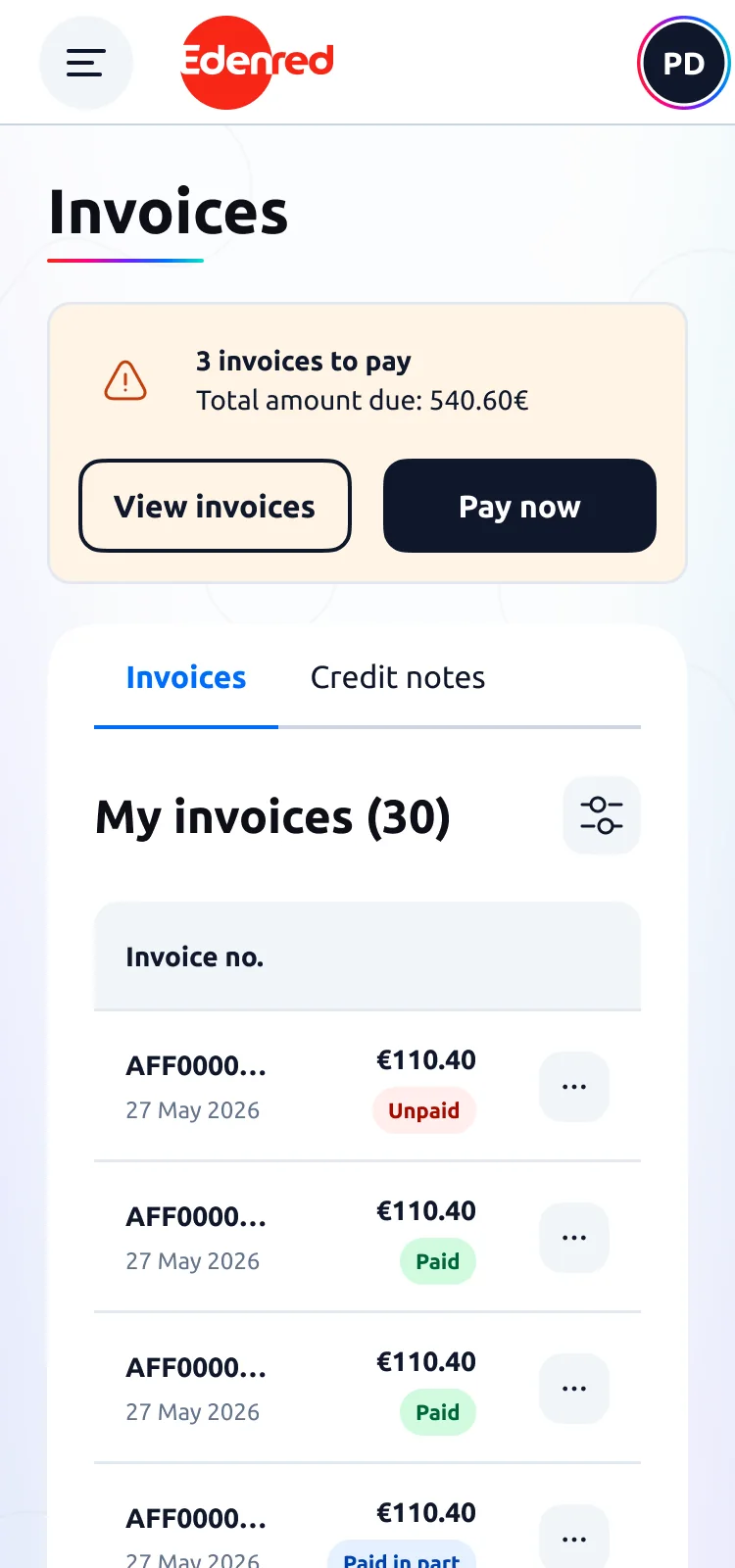
The Edenred merchant portal is where merchants and restaurant owners track their transactions, invoices and points of sale. Every component on this page was designed for that product.

See the Merchant portal project →
The components

Components documented down to the last state

My test for calling a component finished: someone else can pick it up without coming to ask me a question. That means its variants, its states, and how it behaves at every screen size. Here is a selection.

Table & banner

The two components that carry the management screens: the table carries the data, the banner says what’s happening.

Table

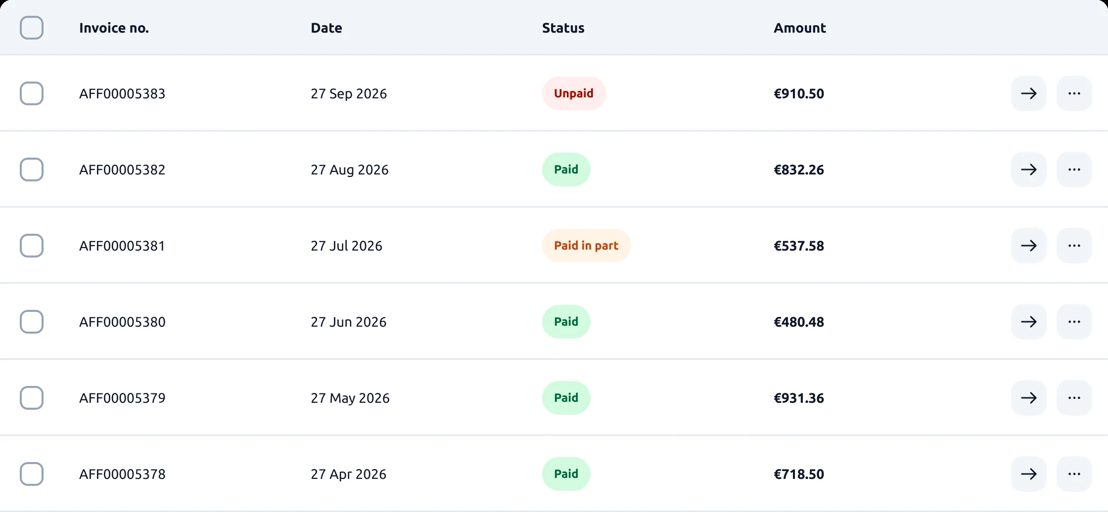
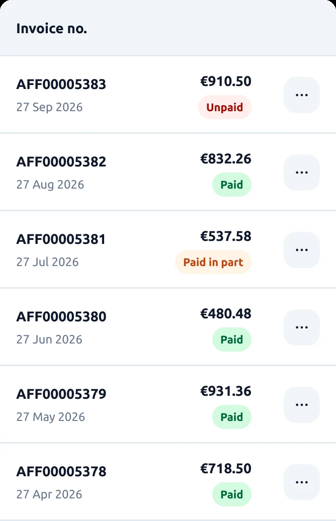
I chose to redraw the table rather than shrink it: columns on desktop, stacked cards on mobile. Three statuses (paid, unpaid, partially paid) and one shared anatomy declined for invoices, transactions and stores.

Anatomy3 statusesDesktop / mobile3 uses
The column header block, with its sorting
Header
The selection block: the row checkbox
Selection
The content block: reference and date, on one or two lines
Content
The status block: paid, unpaid, partially paid
Status
The actions block: open the row, and the contextual menu
Actions
The assembled invoices table on desktop: selection, date, status, amount and actions
Assembled. The blocks together: the invoices table on desktop.
The same invoices table on mobile: each row becomes a card
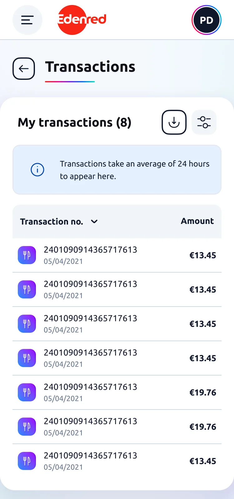
On mobile. Rows become cards.

Banner

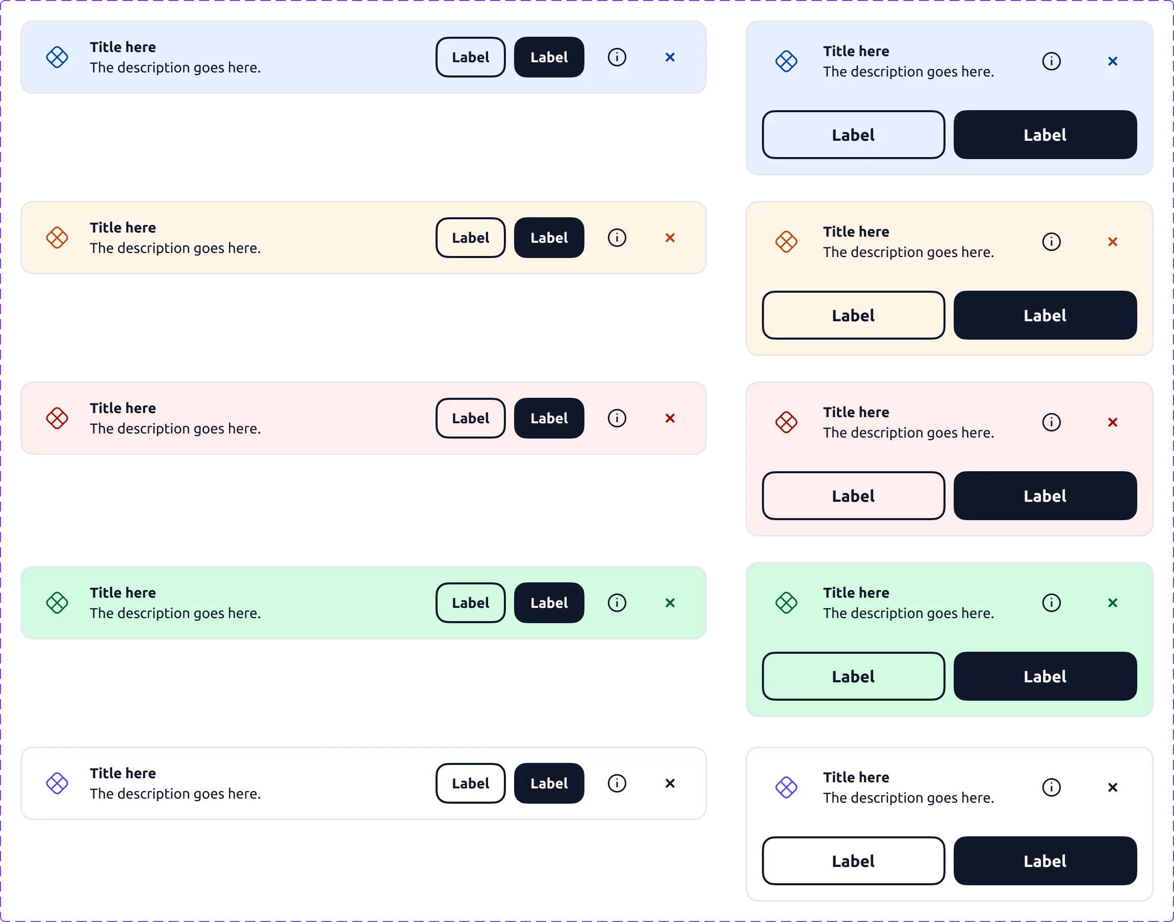
Five registers for everything a screen needs to signal: information, warning, error, success, neutral. I kept the same pieces in all five: icon, title, description, actions, dismiss. On desktop the banner sits on one line; on mobile, the actions move below.

5 registersDesktop / mobileActions & dismiss

The navigation

Everything that navigates: the header, the footer, the menu. I asked all three the same question: what stays when the screen narrows and in what order the rest lets go.

Header

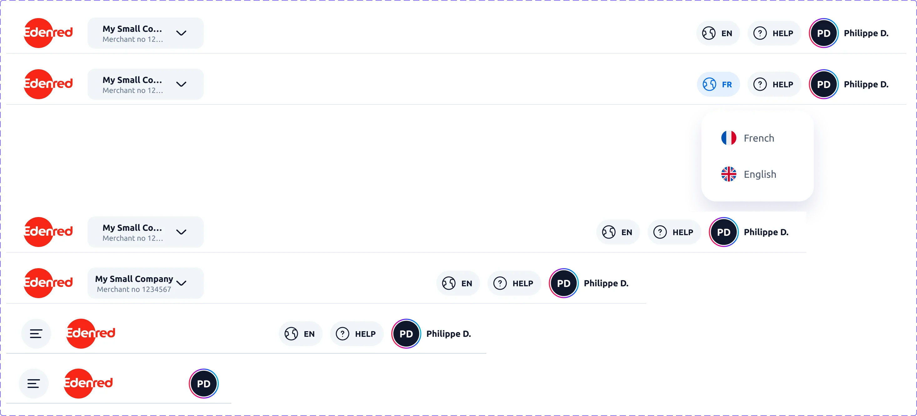
Signed in and signed out, across five screen widths. The whole question was one of order: what goes first, and what holds on to the end.

5 widthsDrop order
The signed-in header across five widths: entity, language, help and account drop in a decided order, down to the compact menu version
Signed in. Entity, language, help, account: what drops first.

Footer

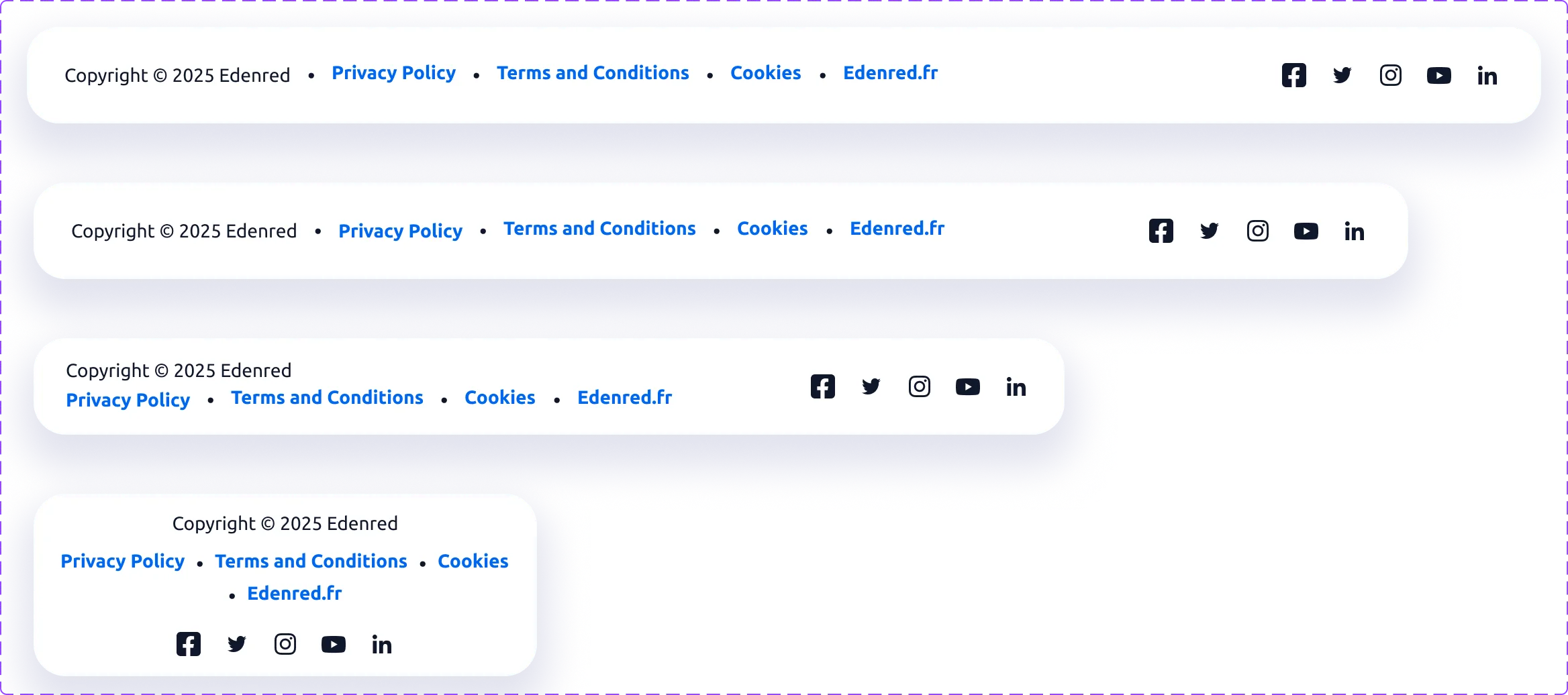
Four widths, from desktop to mobile. I chose to fold everything rather than drop anything: the links move under the copyright, then everything centres.

4 widthsLinks & socials
The footer across four screen widths: legal links and social icons fold without losing anything
Desktop to mobile. The same content, folded rather than cut.

Side menu

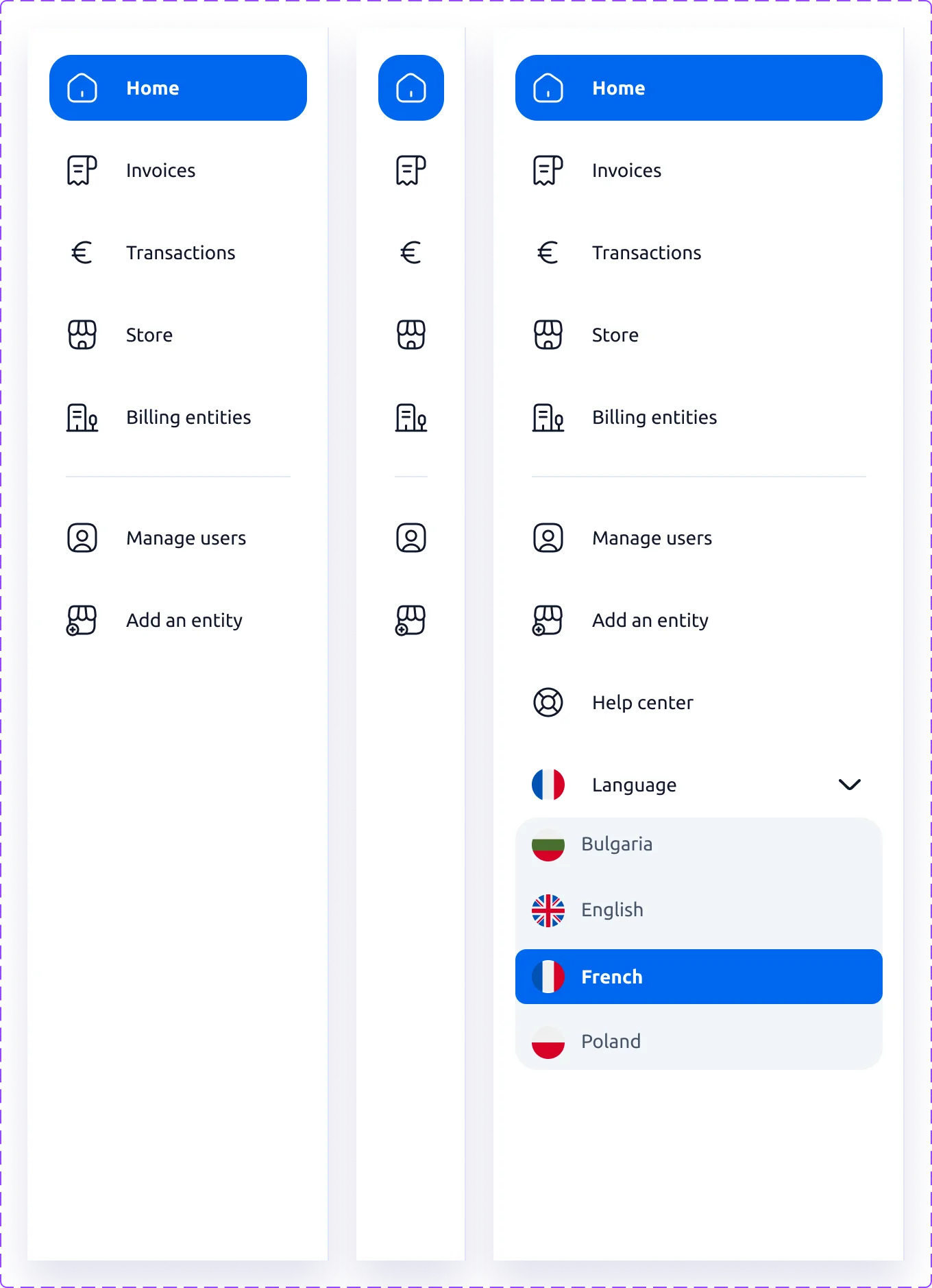
Expanded and collapsed on desktop, then the mobile version, longer: it picks up what the header let go along the way, help, language, account.

The side menu expanded and collapsed to icons on desktop, and its mobile version taking back help, language and account
Labels drop, navigation stays; mobile picks up the rest.
The documentation

What someone else has to be able to pick up

This is what a component looks like when someone else can pick it up without coming to ask me.

The Zeroheight page for the Dropdown component, Design tab: the field in the middle, seven numbered markers around it and their key below
The anatomy of the Dropdown, piece by piece. Seven named elements: the container, the icon, the label, the required asterisk, the helper text, the value and the chevron.
The same Zeroheight page further down: a grid of twenty Dropdown states, empty or filled, idle, focused, disabled and in error, then a Do and Don’t pair about error text
The twenty states of the same component. Below them, the best practices. This one says an error message replaces the helper text instead of adding to it. Two messages under one field is one too many.
The states

A whole journey, state by state

The journey I’m showing is short: updating your bank details, five screens. The heart of it is in the last four, the ones that describe what happens when things don’t run straight.

Here they are end to end, on desktop and on mobile.

This screen uses the Header, Menu and Table components shown above.

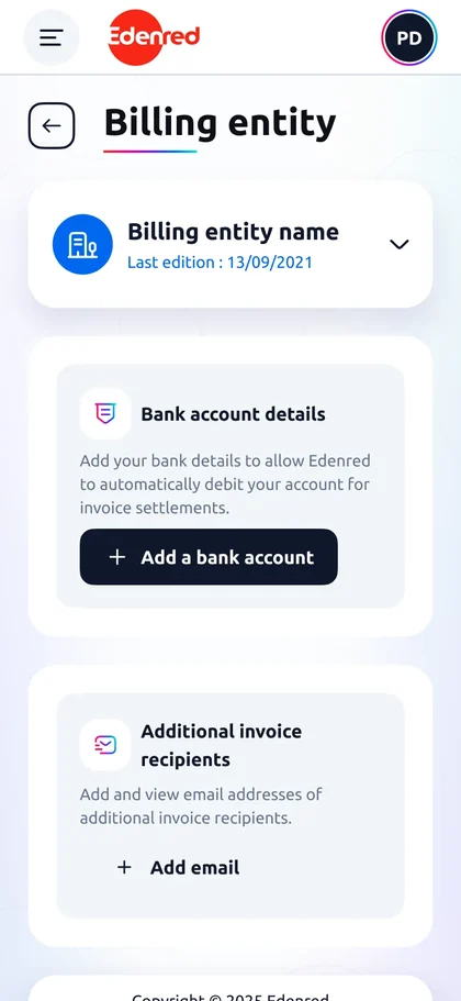
1Empty

No account on file. No status badge, one sentence explaining what this is for, one primary button.
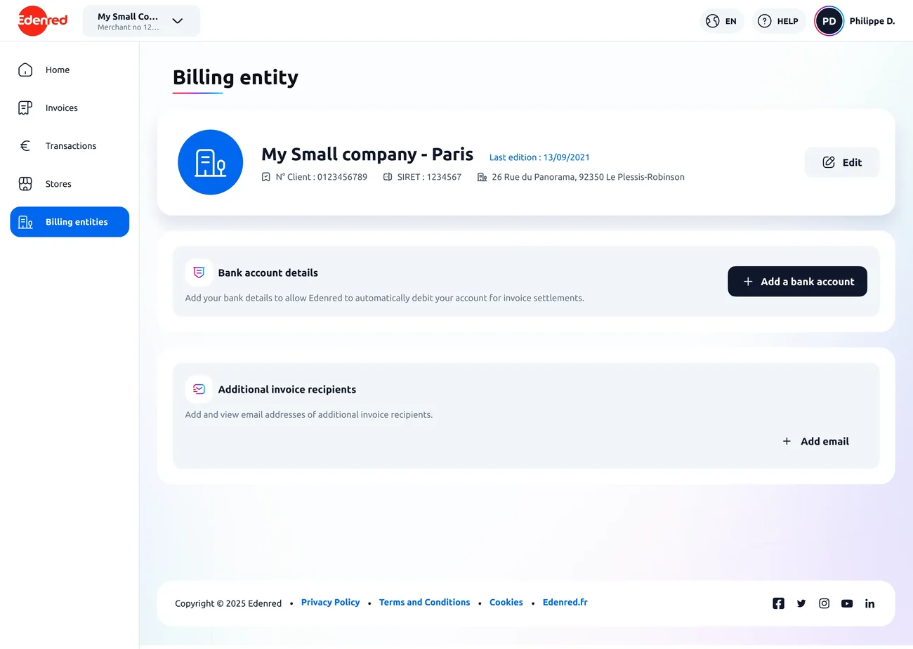
Bank details screen with no account on file, desktop version
Bank details screen with no account on file, mobile version

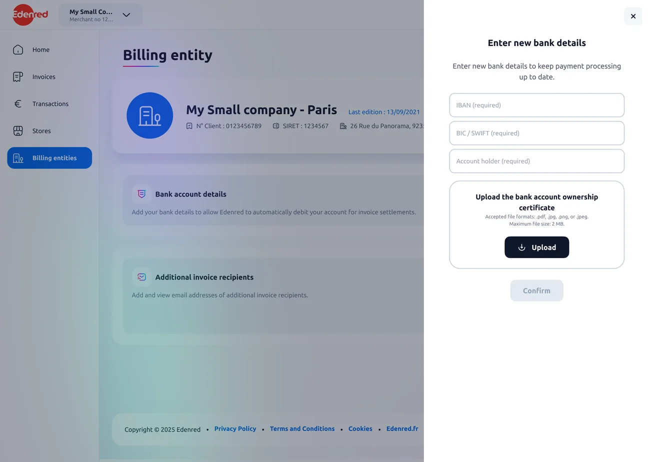
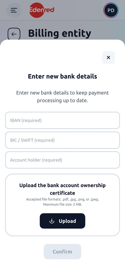
2Form

I announce the constraints before typing: accepted formats, 2 MB maximum.

Blank bank details form, desktop version
Blank bank details form, mobile version

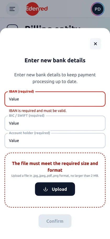
3Error

The IBAN and the file are both invalid. I wanted them flagged at the same time rather than one after the other. Each has its own message and the button stays inactive.
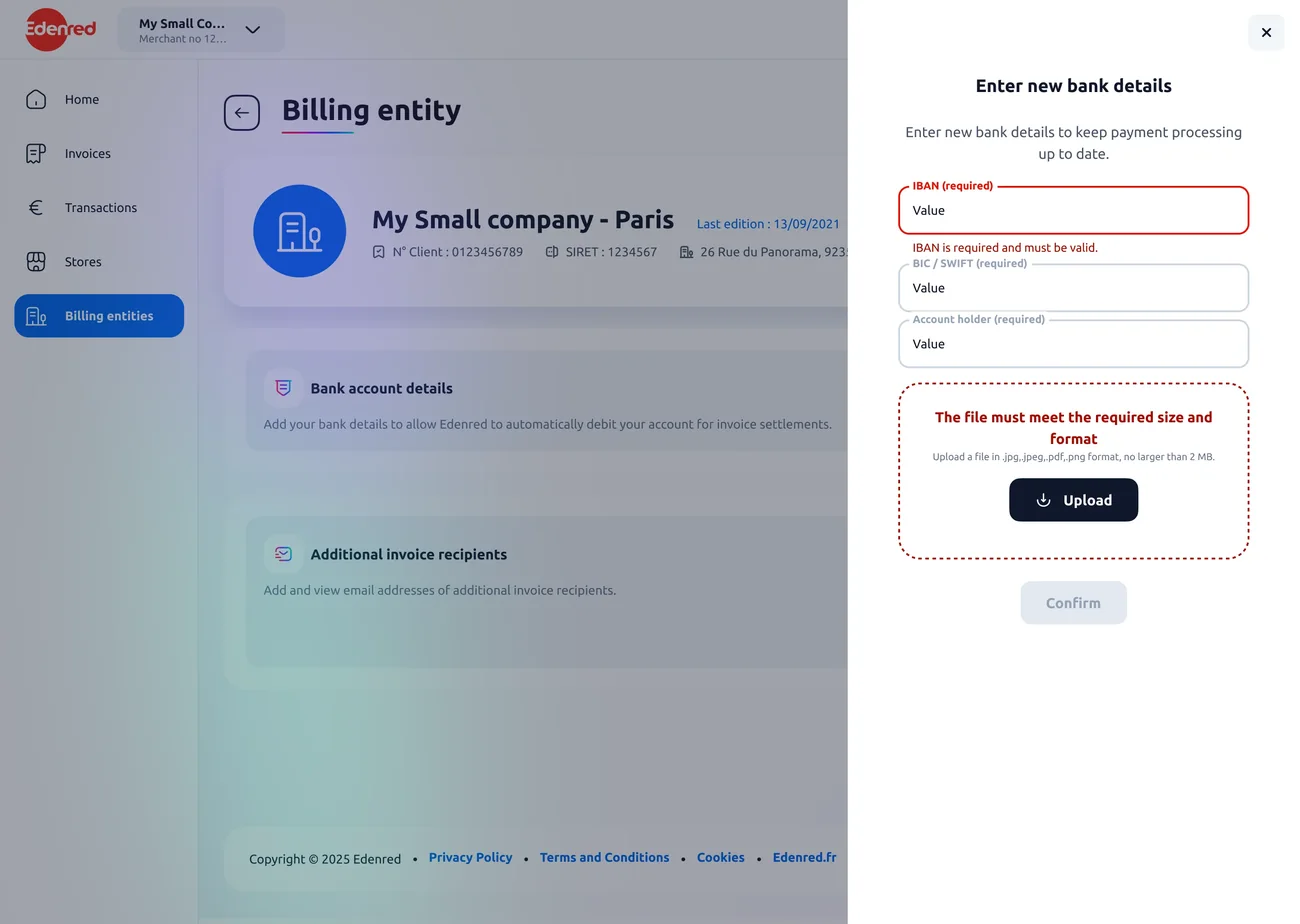
Form with invalid IBAN and non-compliant file flagged at the same time, desktop version
Form with invalid IBAN and non-compliant file flagged at the same time, mobile version

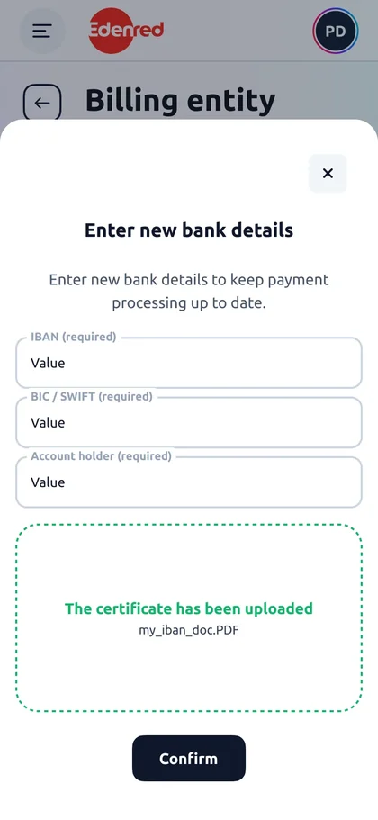
4Partial success

The certificate is accepted. The user knows where they stand before they even submit.
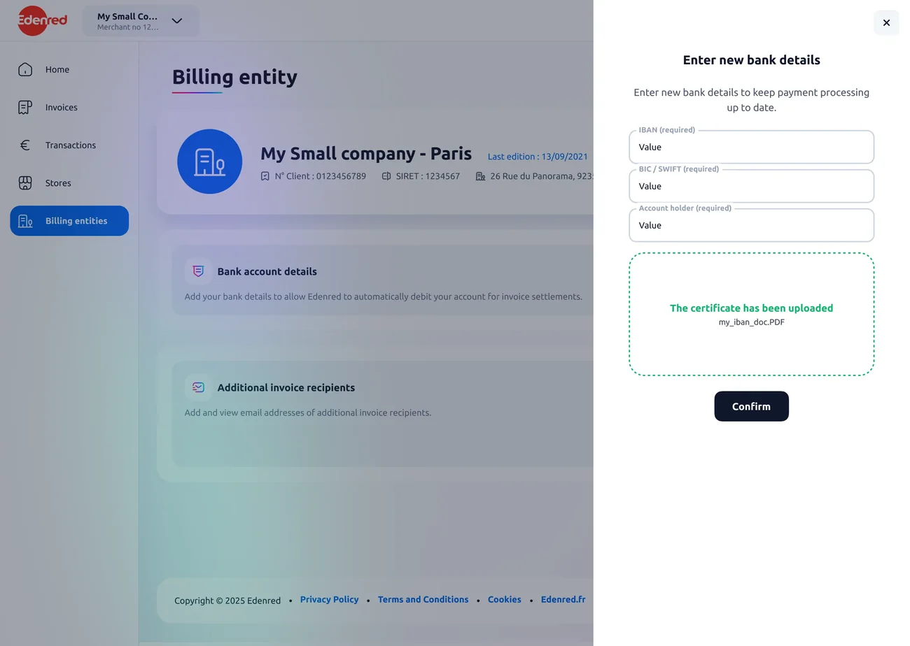
Form with the certificate accepted and the submit button active, desktop version
Form with the certificate accepted and the submit button active, mobile version

5Confirmation

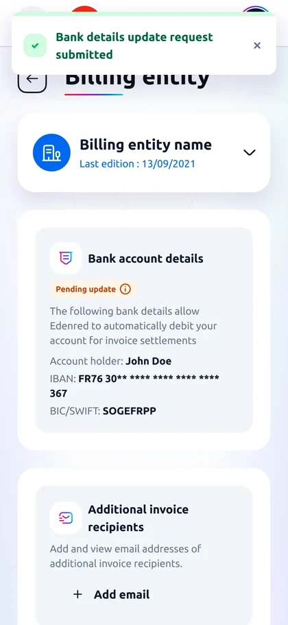
The request is sent. The status moves from active to "pending update". The change isn’t effective yet, and the screen says so.
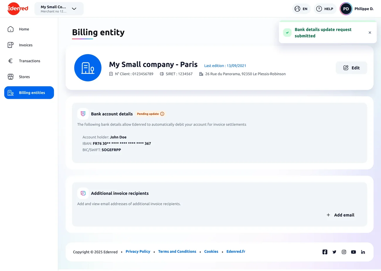
Submission confirmation with the status switched to pending update, desktop version
Submission confirmation with the status switched to pending update, mobile version

My rule of thumb

What taught me the most wasn’t drawing components, it was documenting them. Writing "here is how it behaves when" forces you to find every case you hadn’t thought of.

Day to day, I grow the system. I add the states it was missing for the portal and I propose a variant rather than working around it in my mockup. I also flag the gaps between the documentation and production.