Four products, from B2B to B2C
I spent three years across four platforms and three different audiences. I rebuilt an entire portal there in under three months and went from the screens I was handed to the ones I chose.
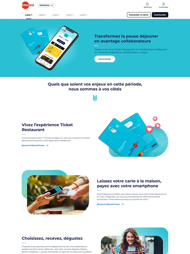
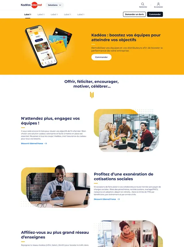
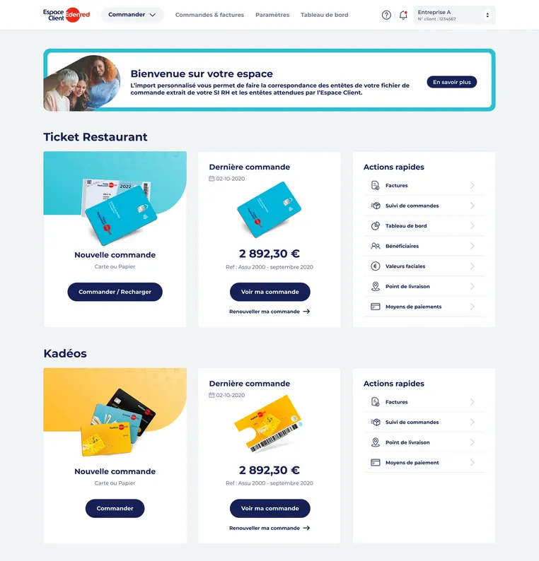
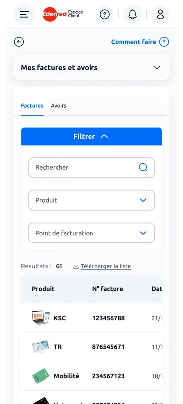
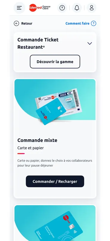
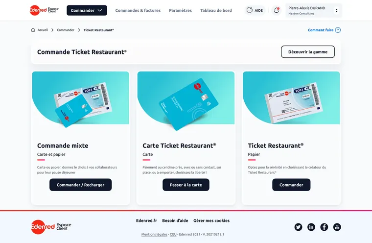
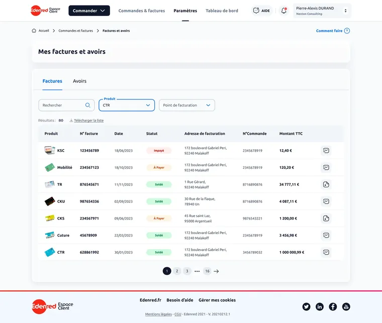
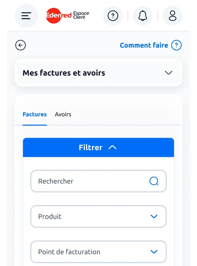
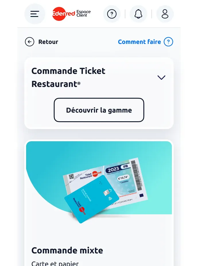
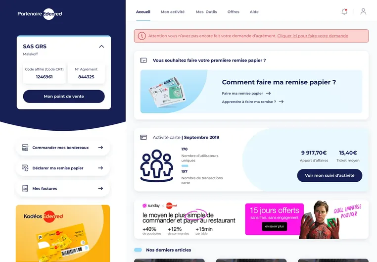
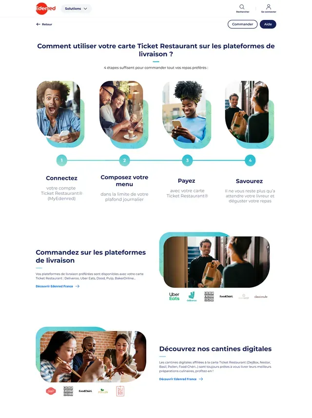
Edenred designs earmarked payment solutions: meal vouchers, gift cards, personal-services vouchers, mobility. Three audiences revolve around them. I was the sole designer on the public site and part of a team on the other three.
The Clients are the companies that order, the Employees are the people who spend, and the Merchants the shops that accept. I worked on the four platforms that serve them.
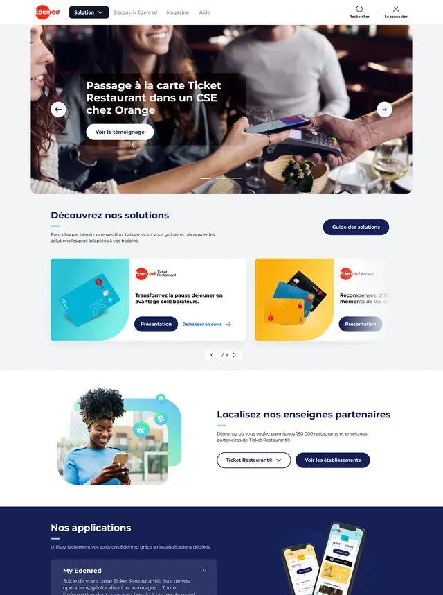
Edenred.fr, the corporate site
Sole designer on the project.
The company’s public site is the main way in to the platforms. The site keeps evolving: page redesigns, photo swaps, banner tweaks.
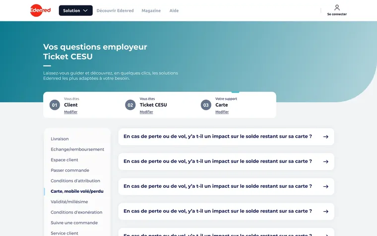
There was no FAQ. Users searched inside product pages or called customer service, which received a lot of repetitive questions. The catalogue is multi-product and multi-audience: the same question gets a different answer depending on whether you’re an employer or a beneficiary, on paper Ticket Restaurant or on Kadéos.
I started with the classic FAQ: a list of questions and a search engine. The search engine was ruled out as technically out of reach. I had to bring people to their answer another way.
That left the single list, which would have recreated the problem we wanted to solve. I couldn’t leave the sorting to the user: they don’t know our product names.
An “Edit” button on every step, to correct course without starting over.
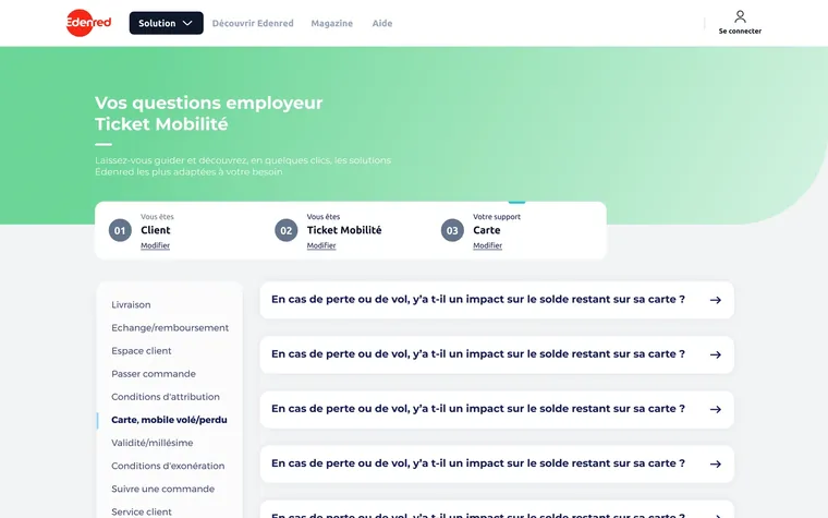
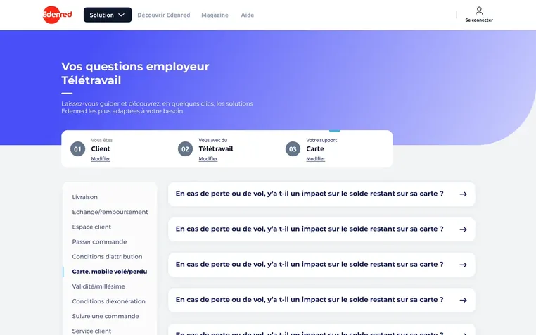
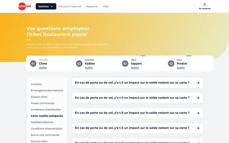
The help centre asks who you are first. You declare yourself in three or four steps and then only see the questions that concern you. Two things make it work: the steps arrive one at a time, never as a full form. The selection trail stays at the top with an “Edit” on each step.
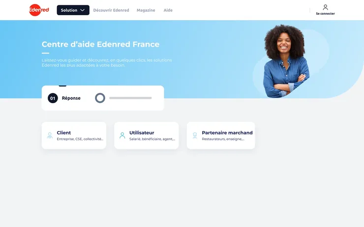
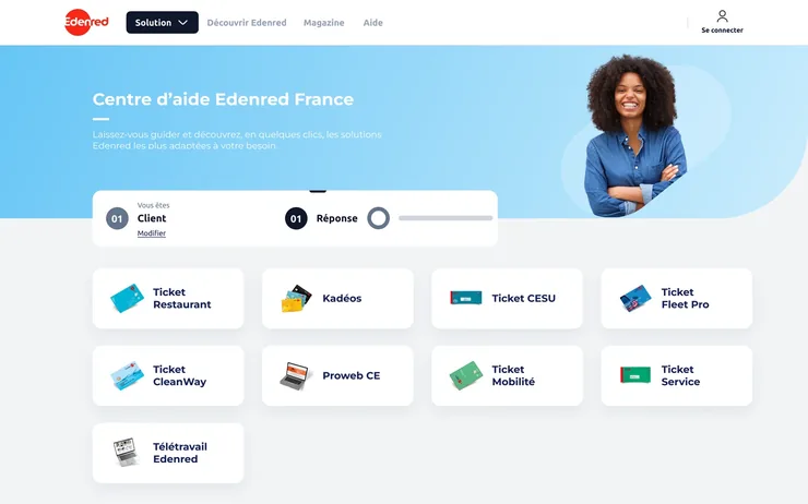
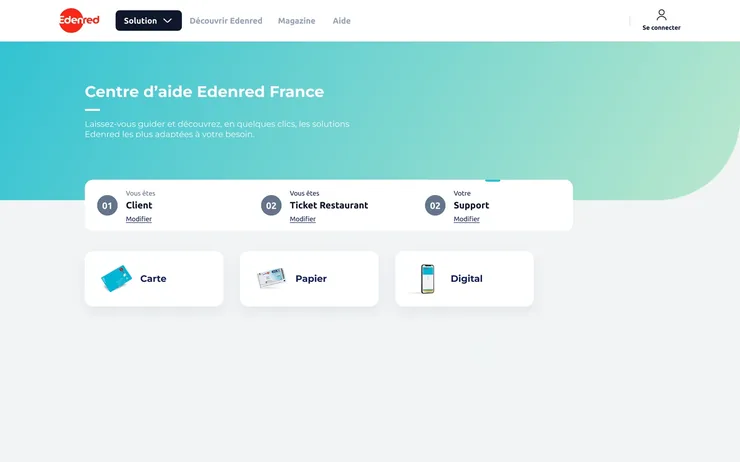
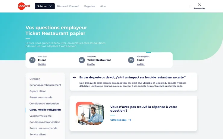
A help centre where navigation replaces search. After identification, two levels are enough: themes on the left, questions on the right, the answer expanded in place, with no intermediate page. The system extends to each product world, each in its own colour.
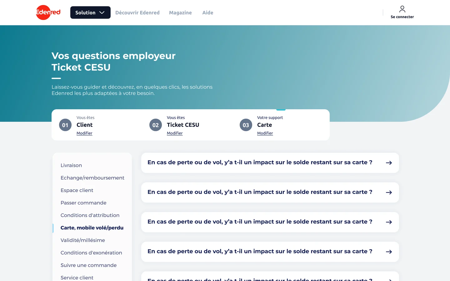
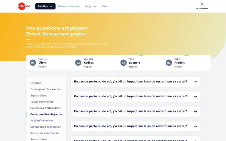
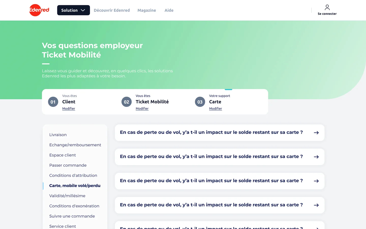
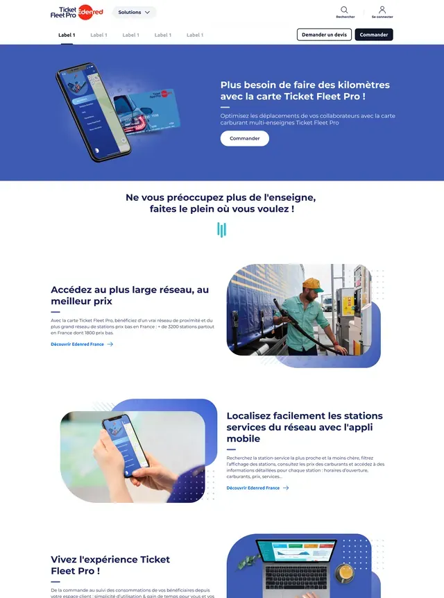
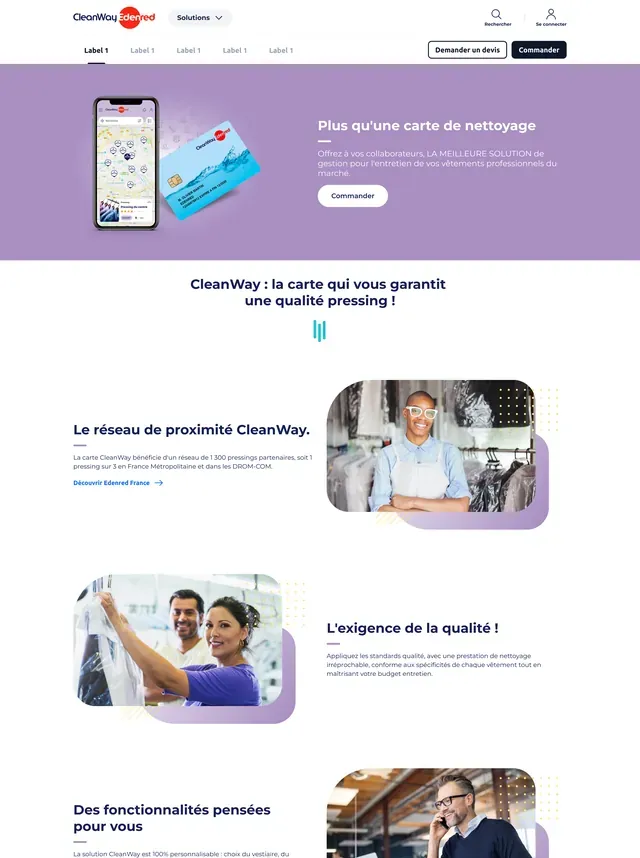
The help centre was only part of the job: I also worked on the whole site’s layout, as reusable components declined from page to page, across a dozen product pages. The site has aged since.
The merchant area, for shop owners
Taking over a very old product: a full redesign, then steady iterations. Several designers over the years.
The portal for the shops and restaurants that accept Edenred vouchers in France. It’s the first merchant ground I worked on: a product nobody had really touched in years, and it showed. I moved it forward in stages.
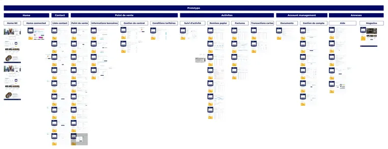
In 2022 we decide to rebuild the merchant area from scratch, with less than three months ahead of us. A lot of pages and features to create, and several old blockers to clear. It’s one of the most demanding projects of my Edenred France years.
The old portal’s mockups were unusable, broken in an old design tool. We started by rebuilding it in Figma, screen by screen. That base is what let us move fast: we knew exactly what we were replacing.

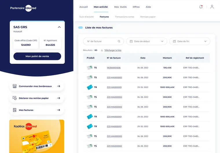
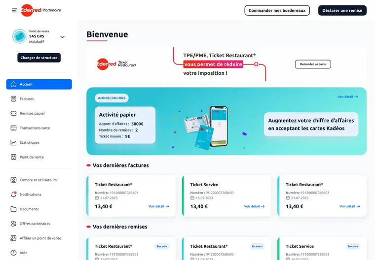
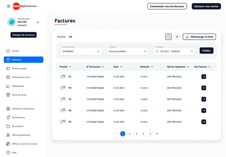
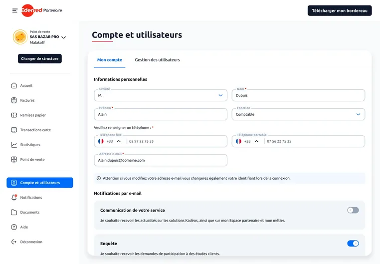
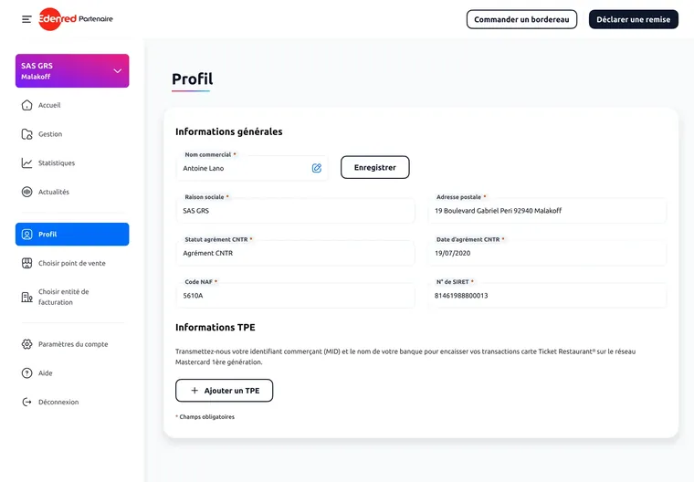
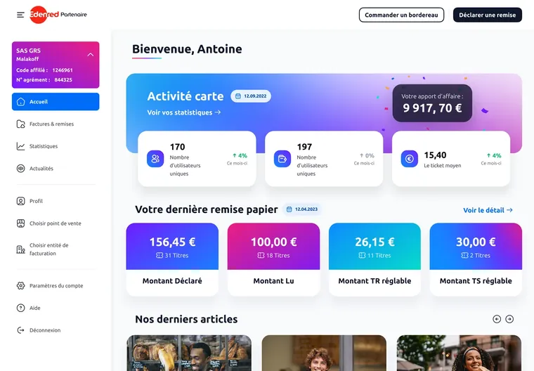
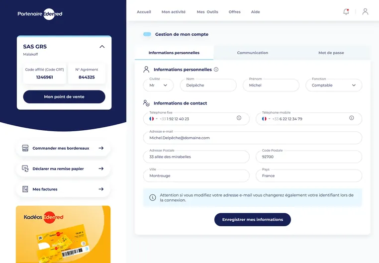
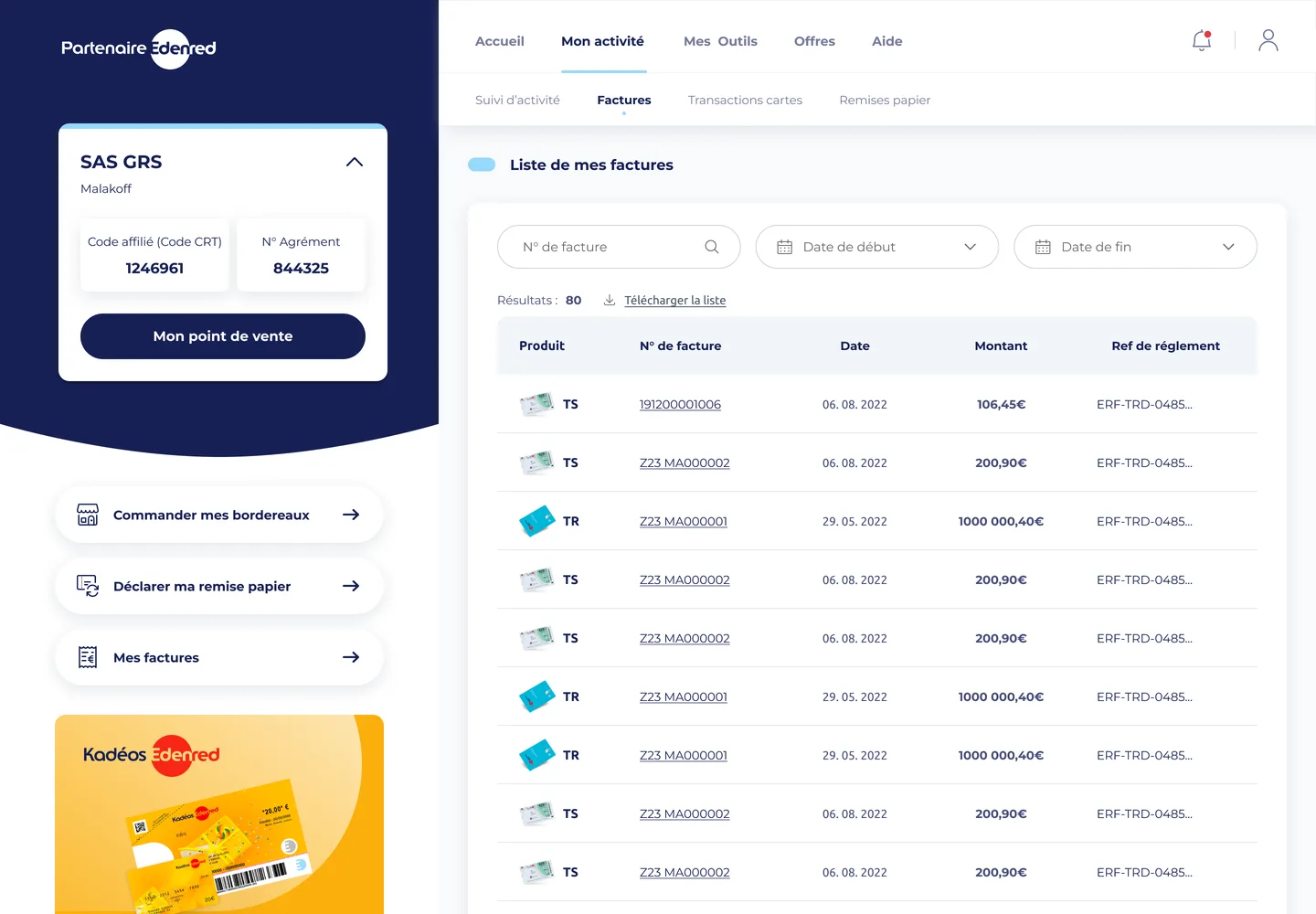
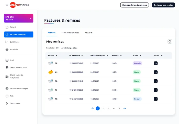
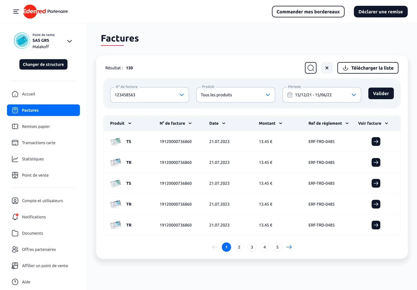
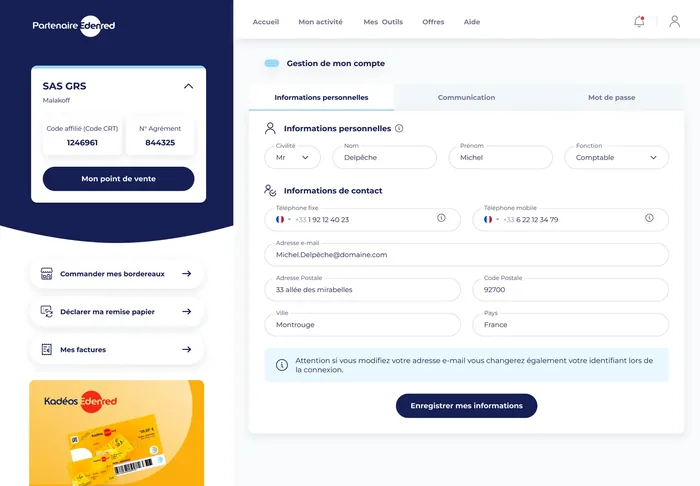
Shipping on time freed up the budget for what came next: each flow was then polished before development. The three screens below tell the story, the home page, invoices and the profile, each in three stages: what was there, my version and the one the team deployed after I left.
The home page, in three stages

The starting portal: navigation scattered across tabs and shortcuts, with the merchant's activity buried among banners.
Same path for the two other everyday screens, invoices and the profile: left to right, the old screen, my version, then the one running today.
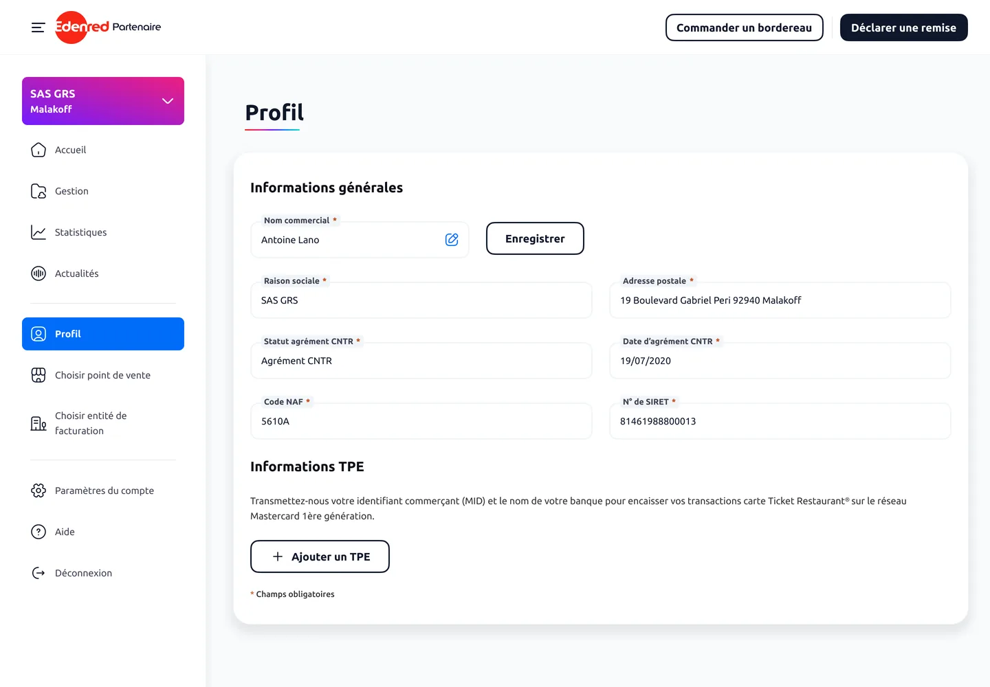
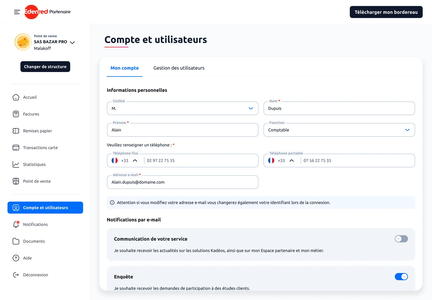
It’s this work on the French portal that fed the next project: an international merchant area, designed with Edenred’s HQ to be rolled out across every country in the group. Turnkey for those without a portal, a replacement for those whose portal is limited.
My Edenred, the app for employees
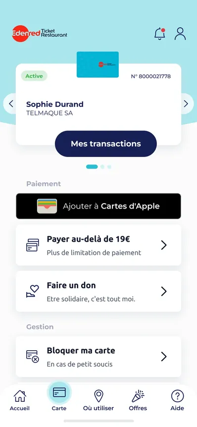
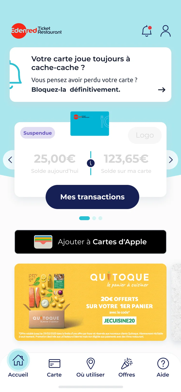
MyEdenred is the mobile and web app where employees check their balance, manage their card and track their transactions. It’s the most used of the four, and the only one where the user comes back several times a week.
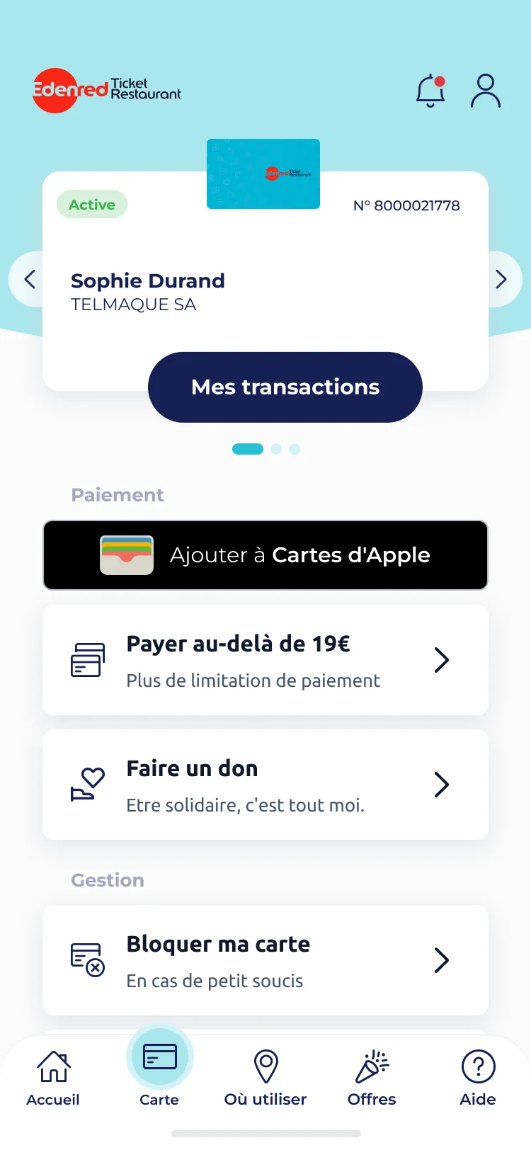
I designed new features on a base already in service, from mobile payment to blocking a card in an emergency.
The Plasticless flow dematerialises the card and its full map gives the real scope of the work on one flow.

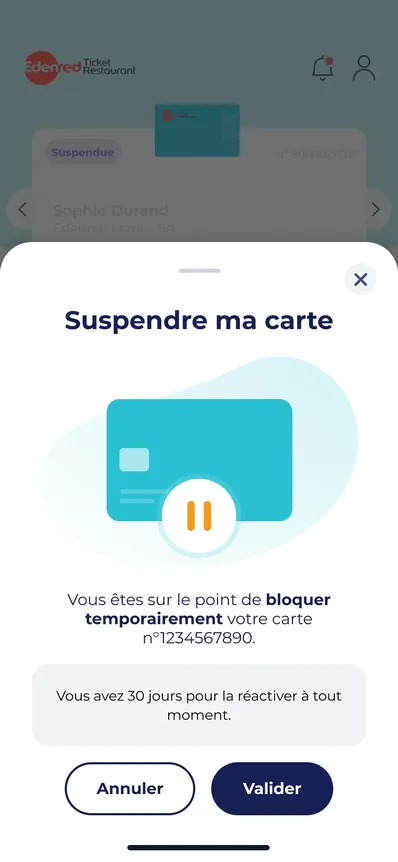
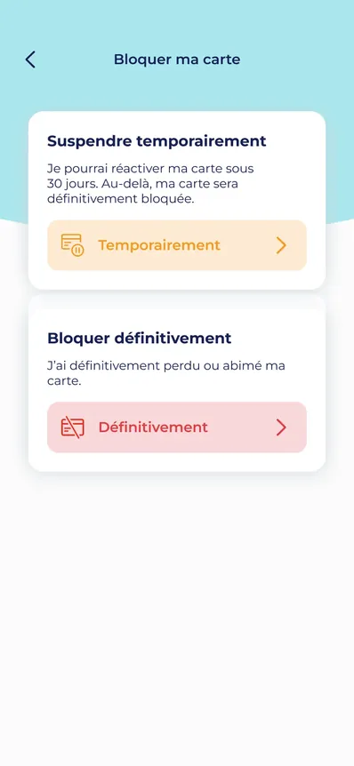
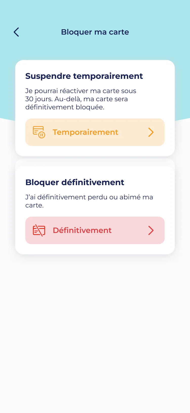
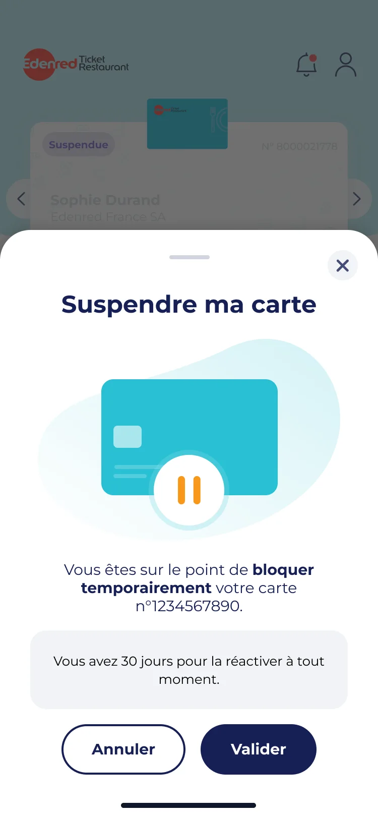
From one card menu, you can trigger two neighbouring actions with opposite consequences: suspend the card, or block it for good. One is reversible, the other isn’t. The risk: someone rushed, card lost, triggering the irreversible while thinking they’re making a temporary move.
The button label can’t carry that difference on its own. What happens after the click must make obvious what you just triggered.
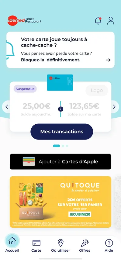
They are two journeys of opposite shape from the same menu. Suspend is a closed loop: the card is paused and “Reactivate my card” returns it to its original state.
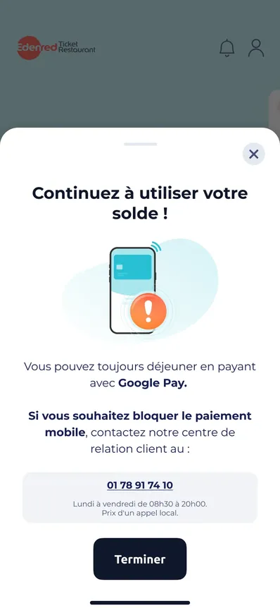
Block permanently is a one-way road: it immediately leads into ordering a new card and into what happens to the mobile payment already set up.
The mobile payment already set up keeps working to bridge the wait for the new card.
The client area, for companies
Designing new features on an existing base. Several designers over the years.
This is the most important of the four platforms: the one where companies order benefits and cards for their employees, and through which several billion euros pass. Everything we do downstream follows from those orders.
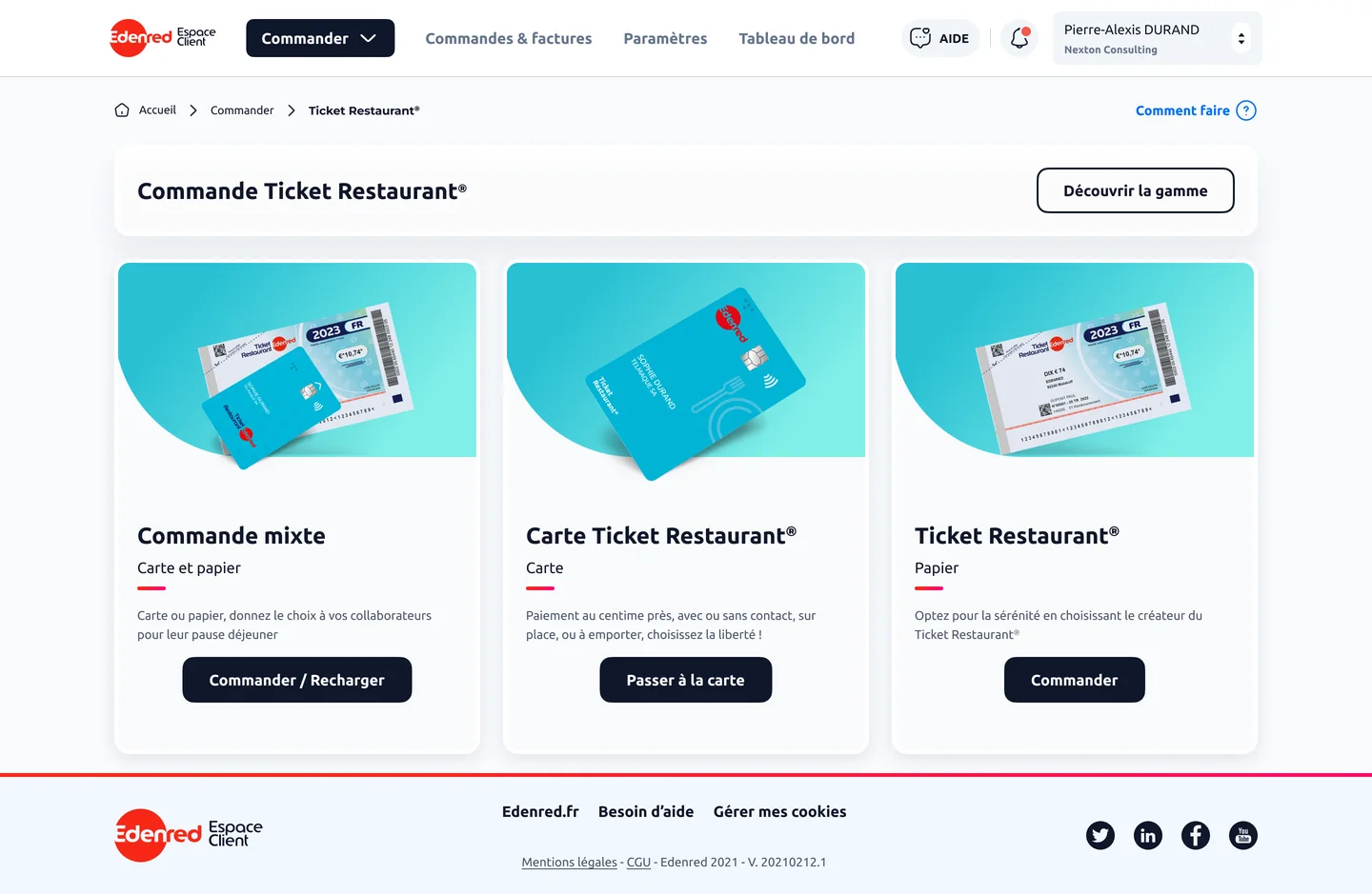
I worked on it as part of a team for several years, on pages already in service and much reworked since.
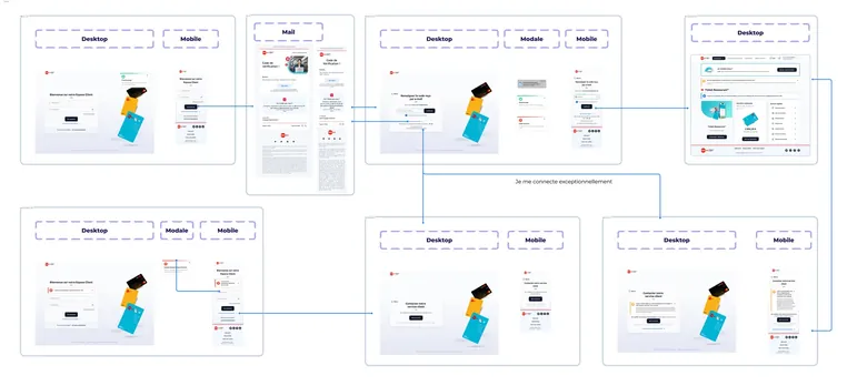
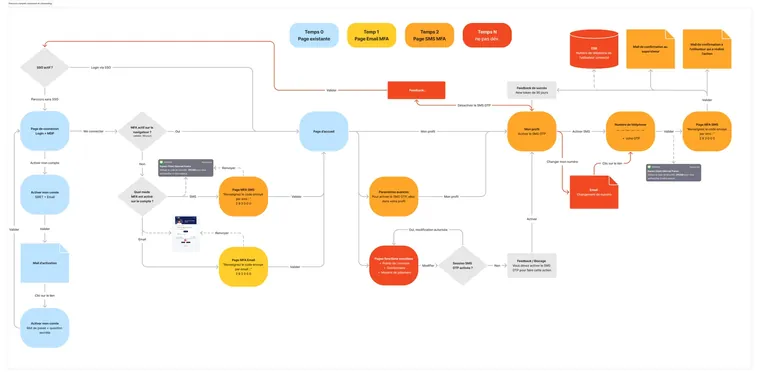
One example among others: the MFA project took as much logic as screens. I mapped every sign-in and activation case, e-mail then SMS, before drawing each step. The balance to strike: ask for the code often enough to protect, rarely enough not to wear out someone who just came to place an order.


What three years on the ground taught me about the business
Almost everything I designed was added to products already in service. I had to work with what was there, and with the work of the designers who came before me. Picking up a living product asks more than starting one, and I got better fast that way.
These projects opened up what came next, I’d understood what French merchants needed. That’s what later let me design for merchants in every country in the group.
Above all I keep the knowledge of the trade. I learned that an employer doesn’t always know the commercial name of their own solution, and that a question about the balance of a lost card gets a different answer depending on the format. None of that was written down anywhere. It comes from three years spent on the ground.
The outcome figures for this project belong to Edenred, so I don’t publish them here. What gets measured on the help centre is the share of repeat questions still reaching customer service.