A restaurant owner who signs up alone and online
This is the flow that lets a merchant sign up alone, online. It has six steps, but nobody managed to fill in the last one.
A six-step online sign-up
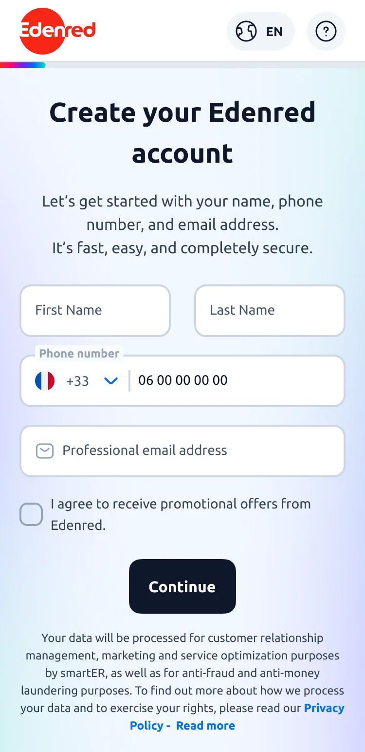
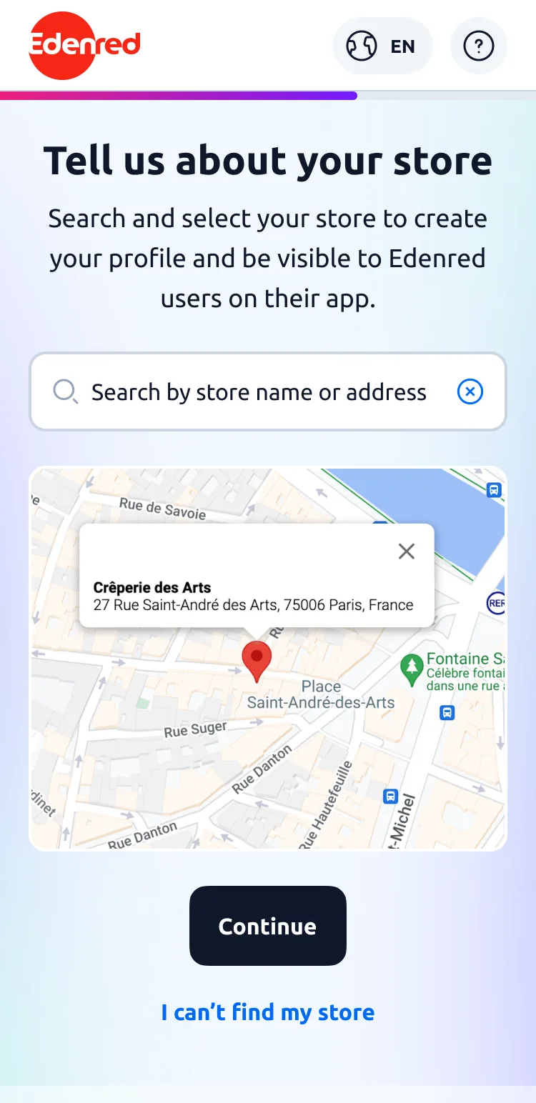
Keep scrolling: the flow moves with you
Restaurants, bakeries and grocery stores accept meal vouchers, and Edenred reimburses them. Before, signing up went through a sales rep or a paper form.
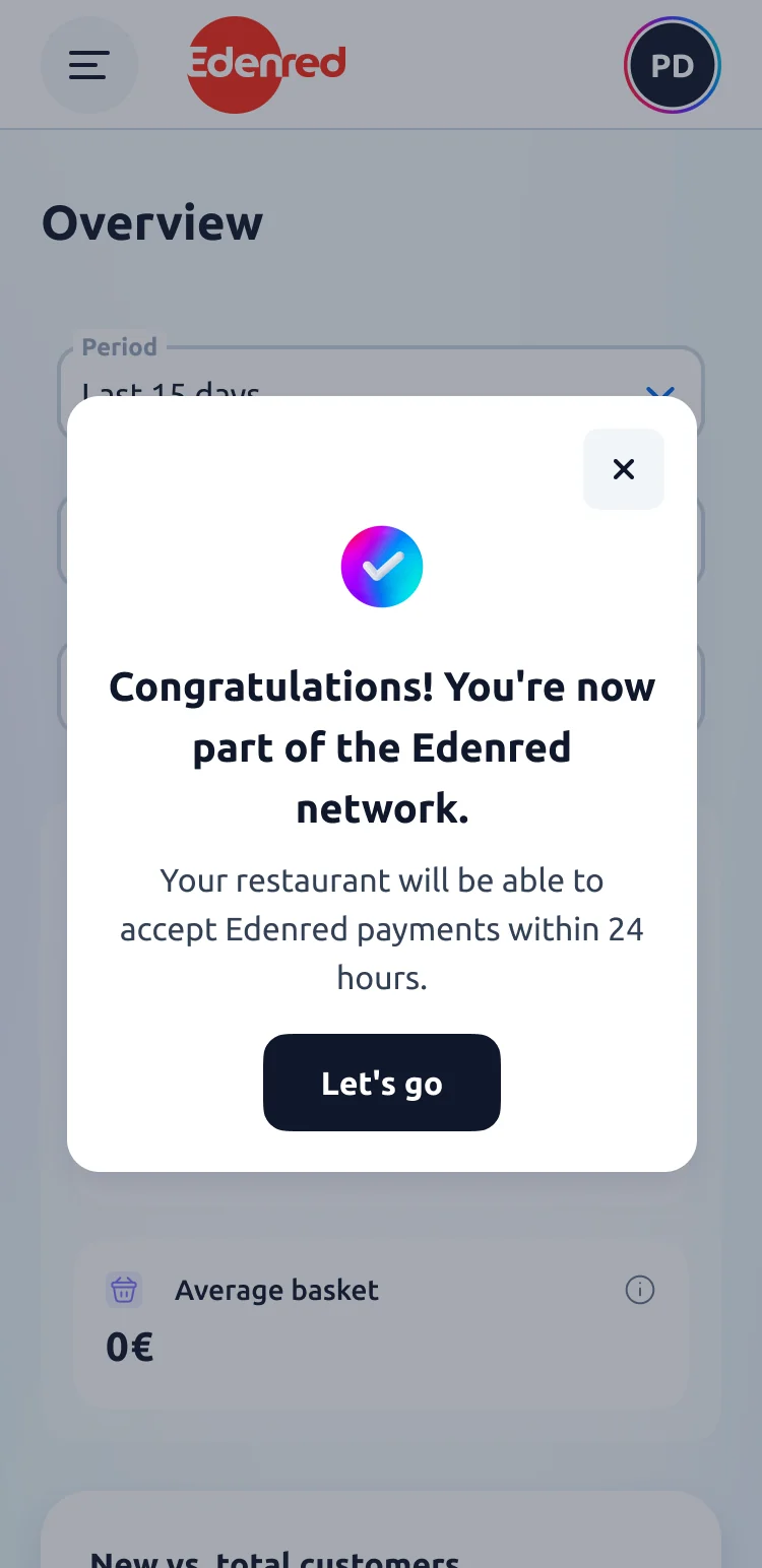
The project is to let them do it alone, online. It all holds together except the last step: every payment terminal carries an identifier, the MID, without which the customer’s card is declined. No merchant knows where to find it.
The flow has six steps, some of them spread over several screens, twelve fields and four documents to dig up: a SIRET number, a Kbis company registration, bank details, a card receipt. That’s a lot for someone working alone, and it’s what fed the first decision.
I was the product designer on this flow: I prepared and ran the user tests, then designed the screens and all their states.
The participants were managers of bakeries, restaurants and grocery shops already signed up with Edenred. The first sessions challenged the whole flow, the later ones two pages (the invoice and the payment terminals). The work stretched over about a year alongside other projects.
- 6test sessions
- 2countries, France and Poland
- 1 yearof work, Nov. 2023 → 2024
I trimmed the journey to take the MID off the critical path
Merchants go through six steps on their own, filling in admin they’d rather avoid. Every unnecessary screen is a chance to drop out.
The first test was rather encouraging: participants found the flow quick and easy. Two things snagged, though. The interstitial screens were misleading, one participant waited several seconds in front of an illustration thinking the page was still loading. The extra information page, nobody understood it.
From the tests to the decisions
I proposed to take the MID off the critical path: you can create your portal access without it and fill it in later. That costs something, we shipped an incomplete flow. But getting the contract signed came first and the MID could wait.
The rest followed: the interstitials merged into the screens they announced, the labels tightened, the flow got shorter.
Not one screen is left that merely announces the next one. Account creation went from two pages to a single screen and its three checkboxes became one. The password rules are shown before typing rather than after the error.
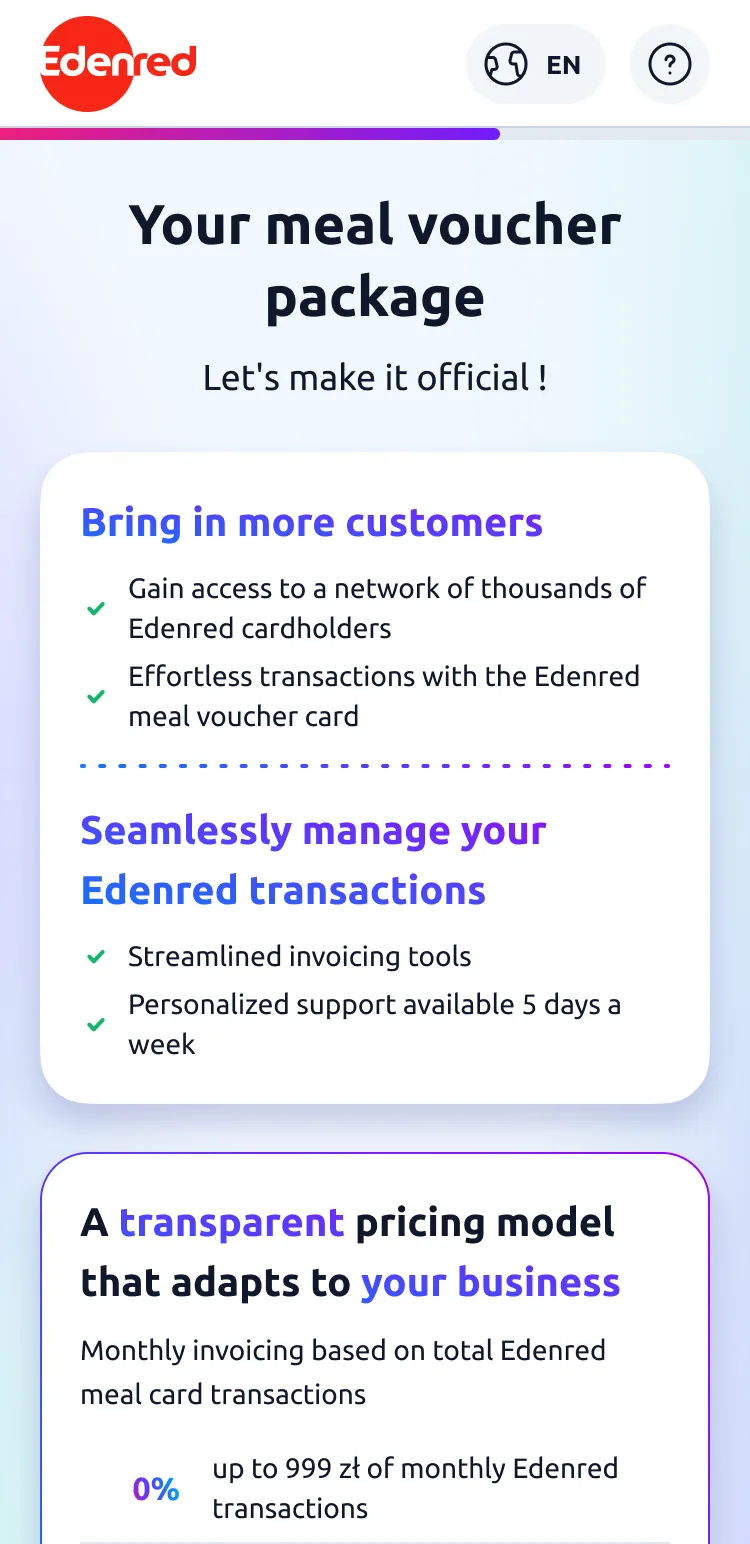
The contract page is the one that moved the most. I went back to it three times, and with each test the vocabulary gets lighter: the fees stop being technical lines, the benefits come first, and the commitment ends up stated in one sentence.
The three versions of the contract page
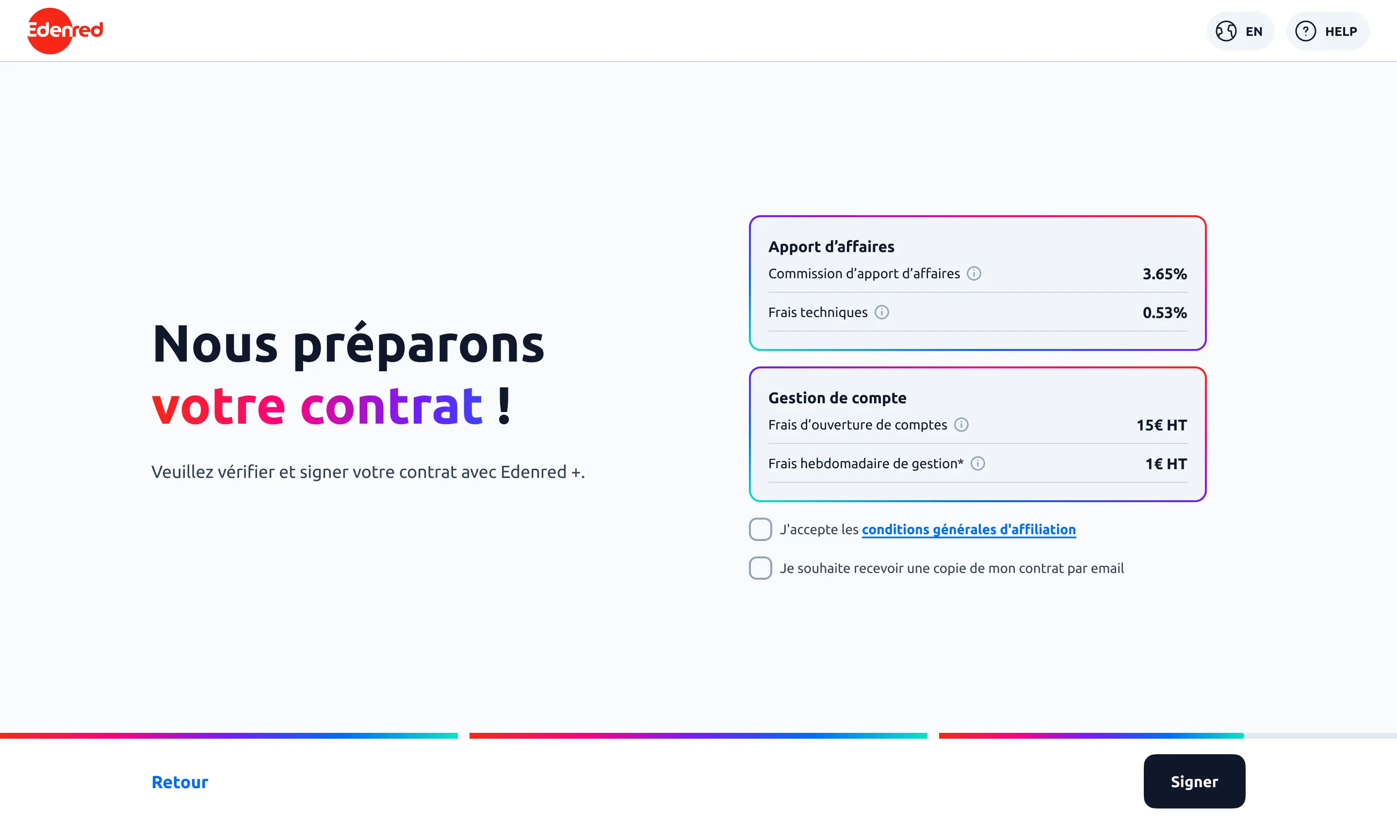
First version: two fee blocks in technical vocabulary.
An ID nobody knows how to find: the MID
One field, one acronym, and not a single merchant able to say what it stands for. One participant searched Google with four increasingly long phrasings, without ever finding it. She carried on anyway, but she would have ended up calling customer service.
"If you hadn’t told me it was my terminal identifier, I would never have guessed."A participant, November 2023 test
One participant left the flow to fetch a receipt from her bakery, and she came back. The MID is printed on the card receipt, an object they handle a hundred times a day. All we had to do was send them to the receipt instead of writing one more explanation.
Two versions had been competing since the first test. Version A: an explicit tutorial, then classic form fields. Version B: a skeuomorphic bet, where the receipt itself became the input interface. Version A won clearly, mostly because it was simpler to build.
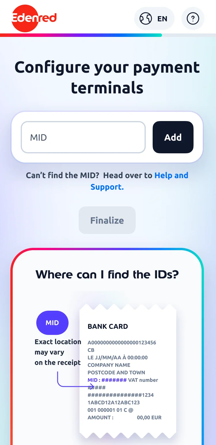
Two ways to enter the payment terminal identifier (the MID)
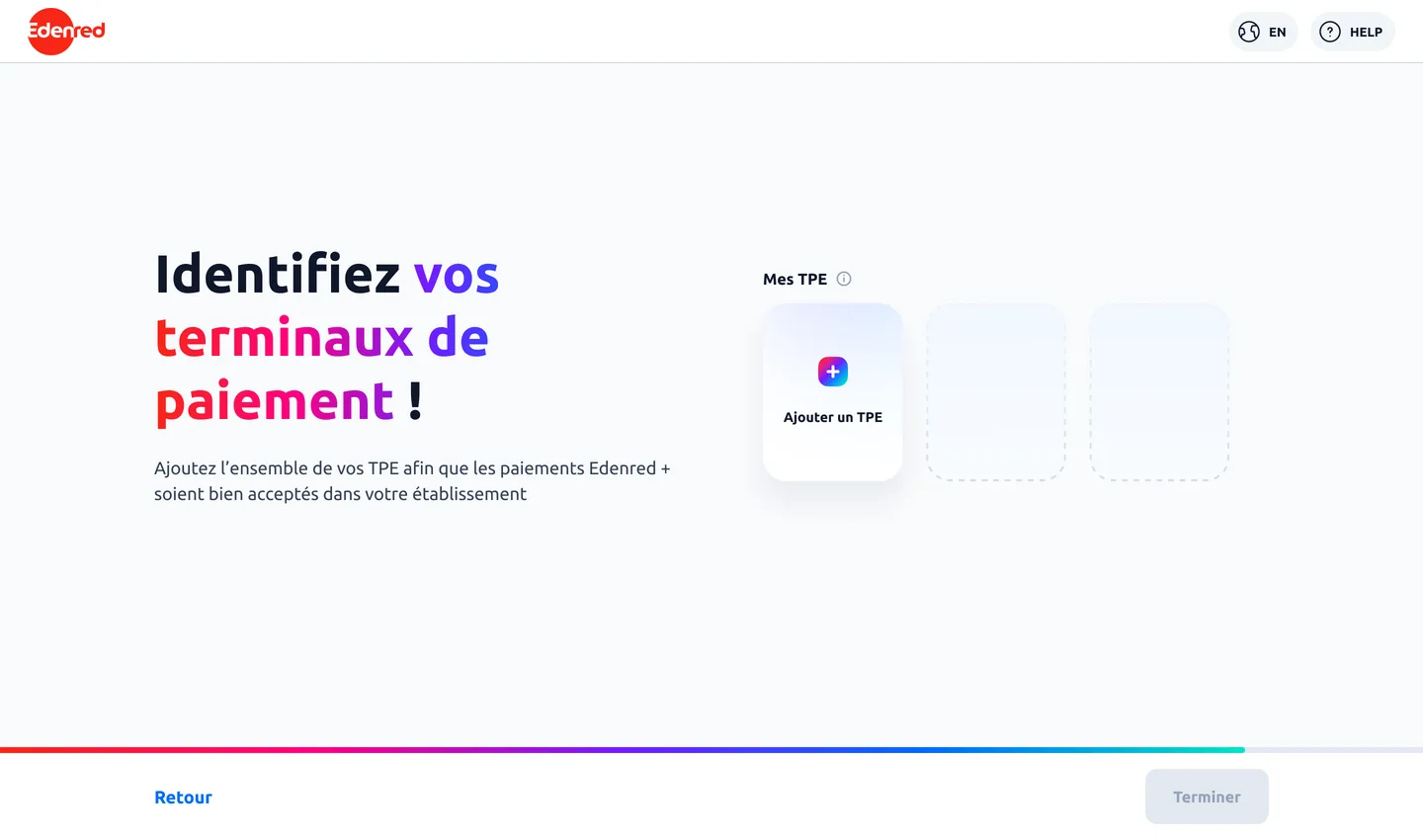
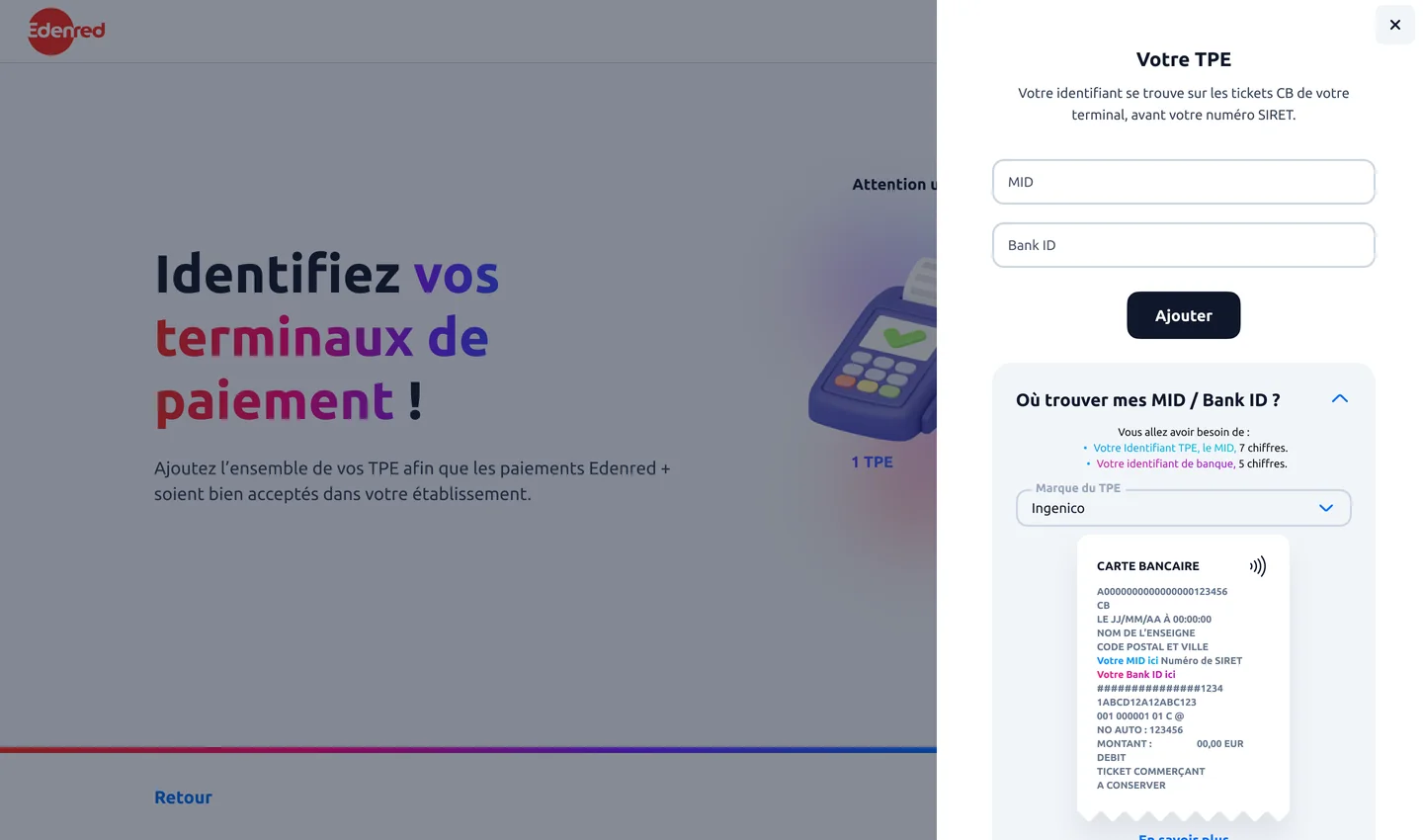
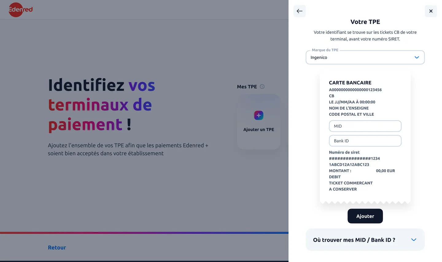
Version A won. “It’s crowded, it gets lost in the content,” one participant had said, looking at version B. Skeuomorphism doesn’t hold up in use: the inputs drown in the receipt and the help sits below the visible part of the screen.
I proposed to keep the best of both versions: version A’s pedagogy and version B’s familiar object. Rather than explaining what a MID is, we send the merchant to an object they already have in hand.
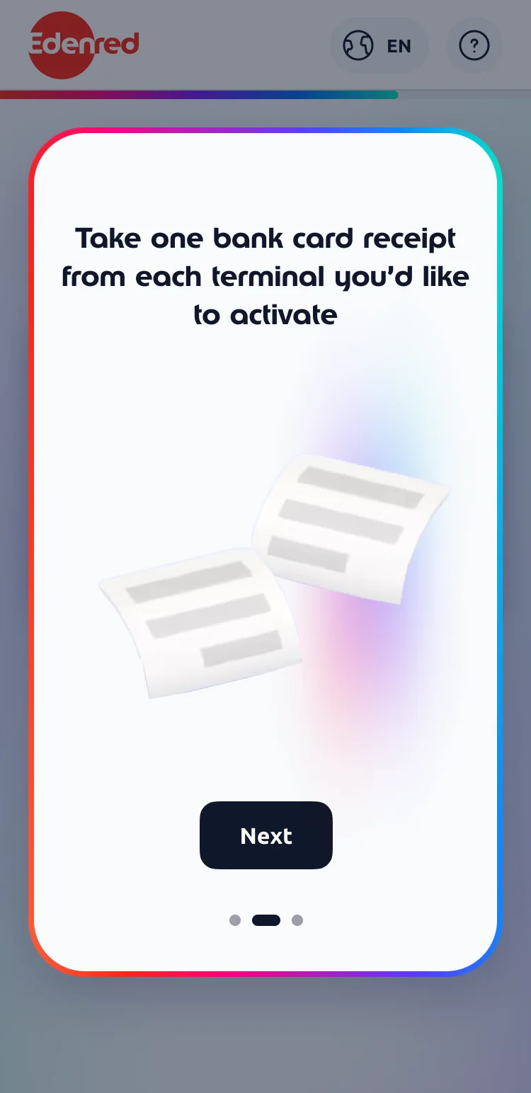
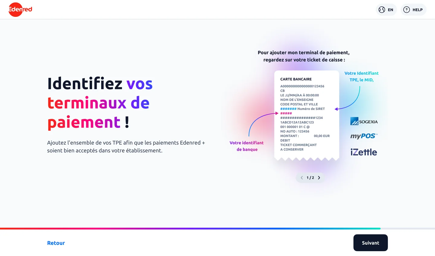
First a three-beat carousel you can’t skip: we say what we’re about to do, we ask you to grab a card receipt from your terminal, then we show where to read the identifiers on it. Only then does the field appear, with help that never leaves the screen.
I went back to this page several times before it held. From one version to the next, the wording of the help barely moves; its place does.
Three places for the same help
This version is the starting point for everything after it: you read first, you type after.
Always visible, never consulted: participants read it as decoration, not as help.
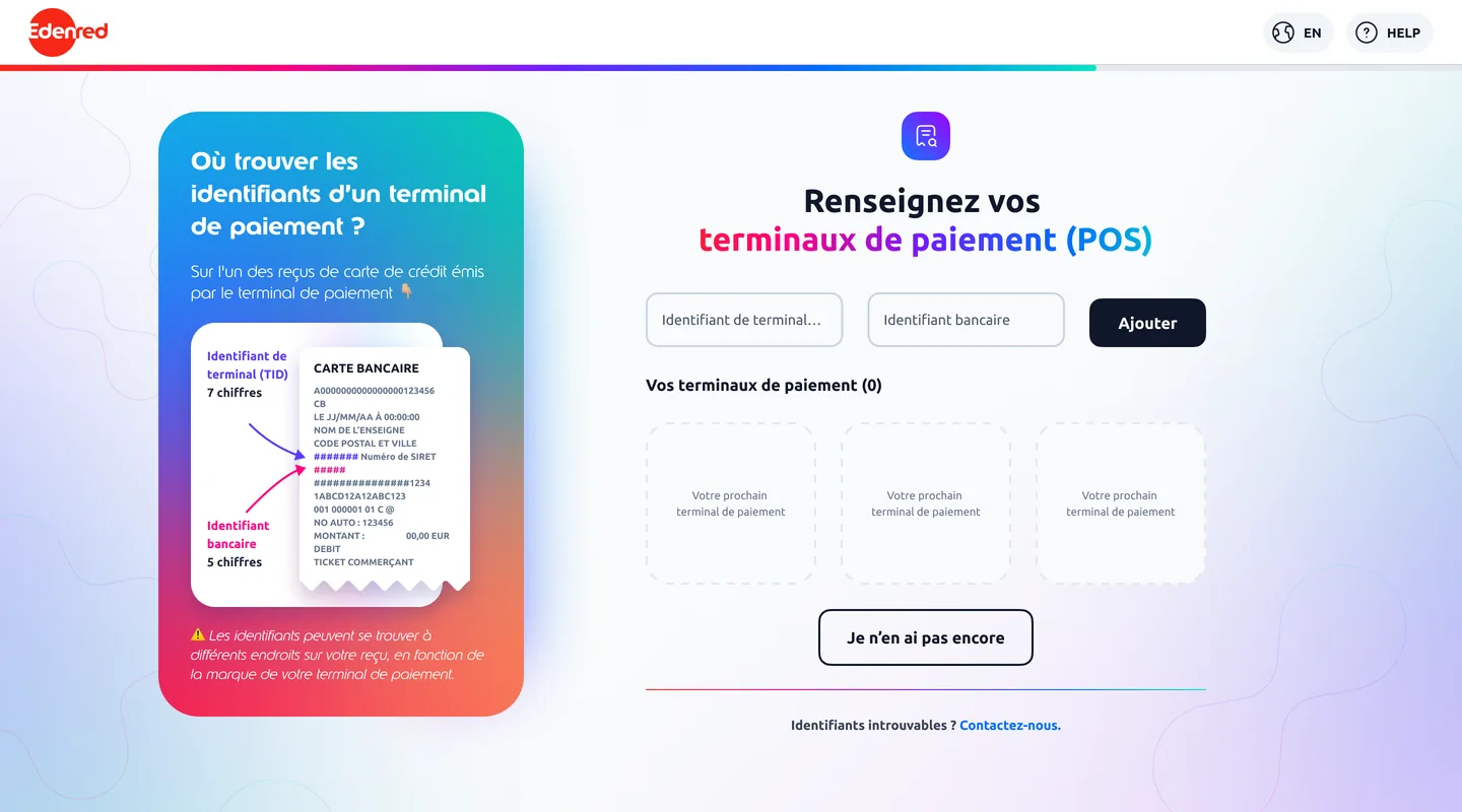
A three-beat carousel you can’t skip then the help docks on the left for the rest of the flow.
- 1We say what we’re about to do. One button, no skip.
- 2Grab a card receipt from your terminal.
- 3Here is where the two identifiers are printed on it.
- 4The field finally appears, the help never leaves the screen, and each terminal added is listed below.
The help was there from the start. It took three versions before anyone recognised it as help.
"In the end, I wouldn’t even have needed the terminal, it’s even simpler since we have the receipts, which everyone has."A merchant, once shown the carousel
What remains is a bare field, help that no longer moves and a way out at every dead end. Each terminal added is then listed and can be removed. The help is also localised: a Polish receipt doesn’t look like a French one, so the content had to be rewritten for each country rather than translated.
Move it rather than rewrite it
For a long time I thought the MID tutorial’s content needed reworking. It started working the day I moved it.
Some things I never solved. A terminal can carry two MIDs, a classic one and a contactless one, and the design still doesn’t answer that case. I also dropped the idea of announcing the MID on the landing page, for lack of a phrasing that worked in every country.
The outcome figures for this project belong to Edenred, so I don’t publish them here. What gets measured on this flow is the share of sign-ups completed without a call to support, and the drop-off on the MID step.